BELITSOFT > Services >Mobile UI/UX Services

Mobile UI/UX Design Services

Regardless of whether you need design services from the start or for application modernization needs, investing in UX design is a smart and lucrative long-term strategy. Every $1 invested in UX design results in a $100 return. That's an ROI of 9,900%, proving that thoughtful and user-centric design can greatly contribute to business success.

Our experienced mobile UX design professionals with years of real-life project experience will perfectly fit even the most complex functionality to the mobile screens.

Get a free quote

Research and Gathering Requirements

You will get a highly useful, competitive, and profitable application thanks to a thorough data collection performed by our team.

At this stage, we gather your requirements – branding, color scheme, logo and design ideas, a list of required features, and other details.

We also make the competitors’ analysis and investigate the best practices in the niche.

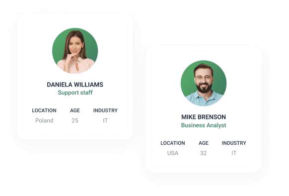
Defining and Examining User Personas

The primary goal of UX designers is to build for you an easy-to-use, intuitive and responsive product that will get positive feedback from customers.

That’s why our team allocates time to understand which target audience will use your app, what they expect from it, and which problems the app should resolve for them.

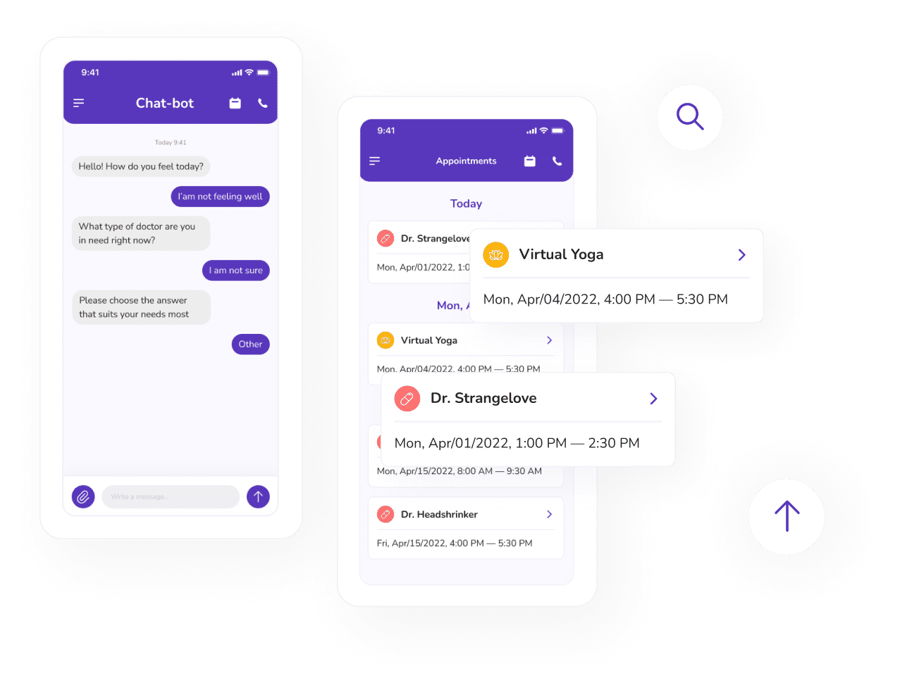
Designing a mobile application

Our designers’ priority is to create a simple, concise, and easy-to-use UI that will easily fit into your user’s information context.

At first, your app will receive its core visual and stylistic UI details to create a realistic view of how the app will work and look like both in mobile and web versions.

Then the designer will embark on designing the app. They can simultaneously design mobile, tablet, and web versions of your application, if needed.

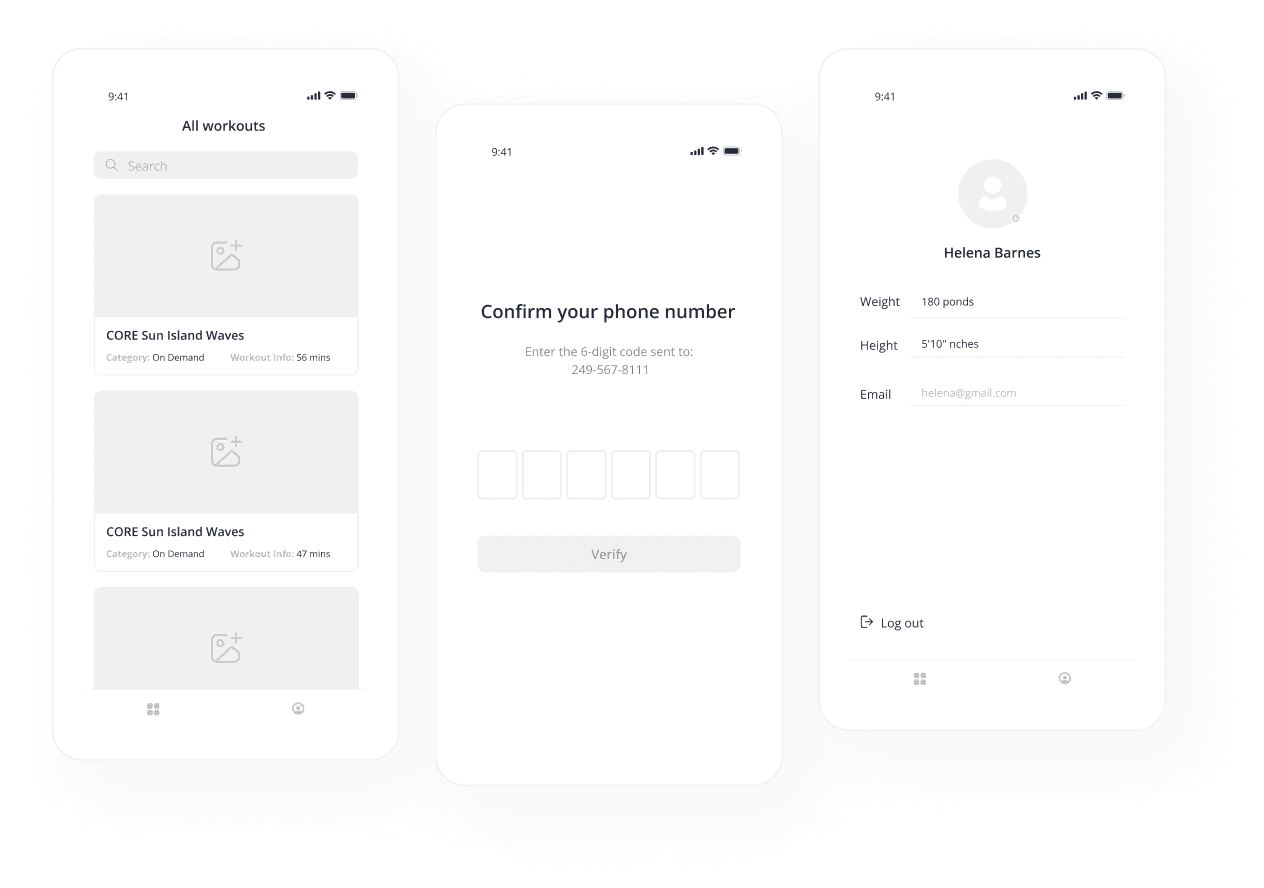
Creating Sketches and Mock-Ups

Our designers create sketches to demonstrate ideas and functionality, visualize user flow, discover potential issues and solutions prior to designing and development.

You will get layed out every screen of your future app and will be able to make sure that your user will like the UI and can easily find the information they might need.

If needed, our designer will create mock-ups to attract investors for the project.

Research and Gathering Requirements

You will get a highly useful, competitive, and profitable application thanks to a thorough data collection performed by our team.

At this stage, we gather your requirements – branding, color scheme, logo and design ideas, a list of required features, and other details.
We also make the competitors’ analysis and investigate the best practices in the niche.

Passing the UI kit to developers

The final stage of work for the design team is the creation of the UI kit. It includes essential UI components like fonts, final design layouts, icons, documentation, etc.

Now, a dedicated mobile app developer from Belitsoft can proceed to the app development. Along the development process, Belitsoft’s team lead designer will carry out the supervision.

You’ll always stay updated on the changes through monthly demos and are welcome to give feedback.

Performing UI testing

When developers finish the app development, the team lead designer will run UI testing. It will help detect visual defects, such as the wrong font size, text indentation, button color, etc.

All the errors and issues will go back to developers. After fixing the encountered issues, the designer will run UI testing again.

You are guaranteed smooth functioning and great UX of the end product after a series of thorough checkups.

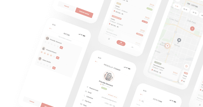
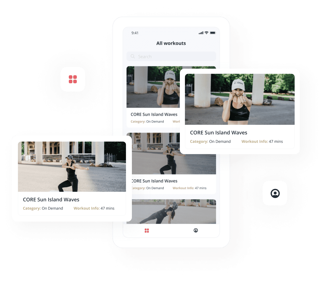
What Features Your Mobile App Can Get

Single Sign-On

You’ll get an app with SSO, or Single Sign-On. It will allow your users to be authenticated and logged in automatically to the applications through their Google and Apple accounts or social networks.

SSO improves user experience by saving between 5 to 15 seconds per login since it removes the need to hop between multiple login URLs and manually input the data.
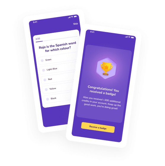
Gamification

Use gamification in your app as a powerful tool for increasing user engagement, retaining users, and building loyalty toward the app creator overall.

Belitsoft’s UX designers can apply various gamification techniques to spice up the mobile experiences of your users: badges and stickers, leaderboards, challenges, points, or journeys.

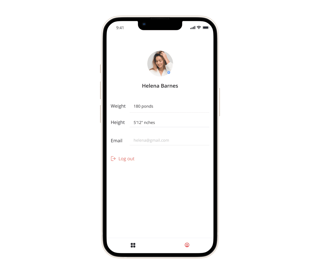
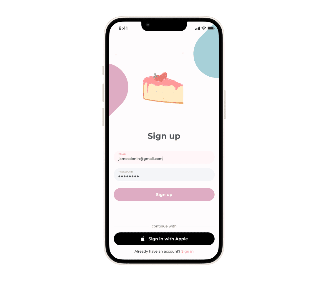
Elaborate User Profile

Creating a user-friendly, simple-to-use, and engaging personal profile is a must in UX design, as profiles become the main interaction point of your users with the app.

Belitsoft’s design team will make user profiles in your app a means of user engagement and retention. For that, we’ll add multiple customizable elements (profile photo, nickname, color scheme, statuses, etc), build in a social sharing option, create an achievement board, or design another specific solution that will fit your product and niche.

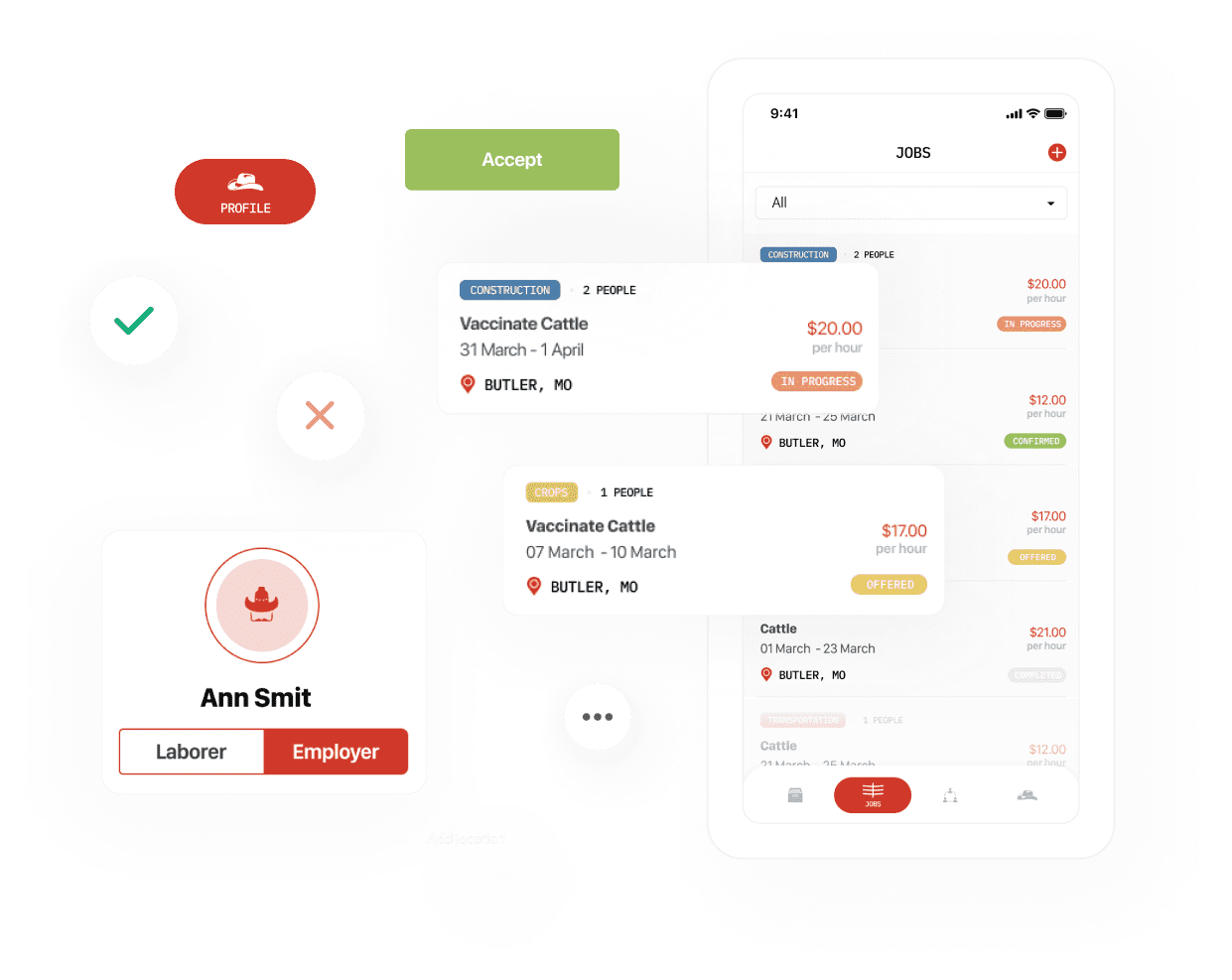
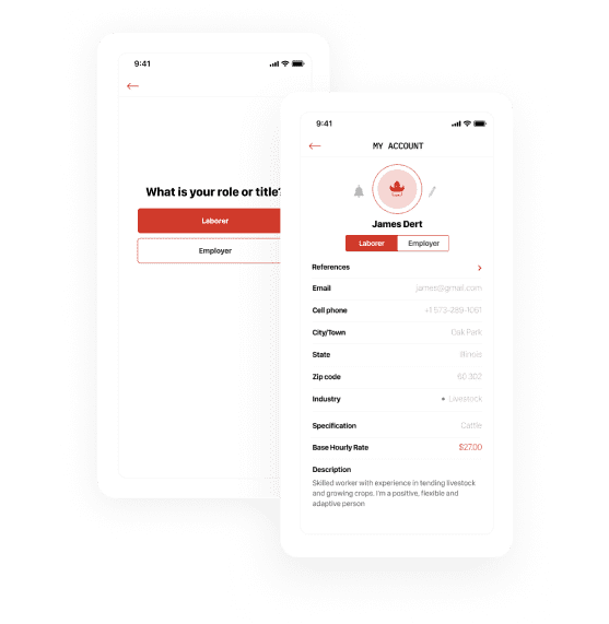
Switching User Roles within One Account

Switching roles within one account is highly helpful if you create such an app as a marketplace, where users may act both as service/product providers and buyers.

In this case, such functionality covers all of the user’s tasks. They can sign up (log in) to the application using either role. Once logged in, they can switch between the roles in a few clicks.
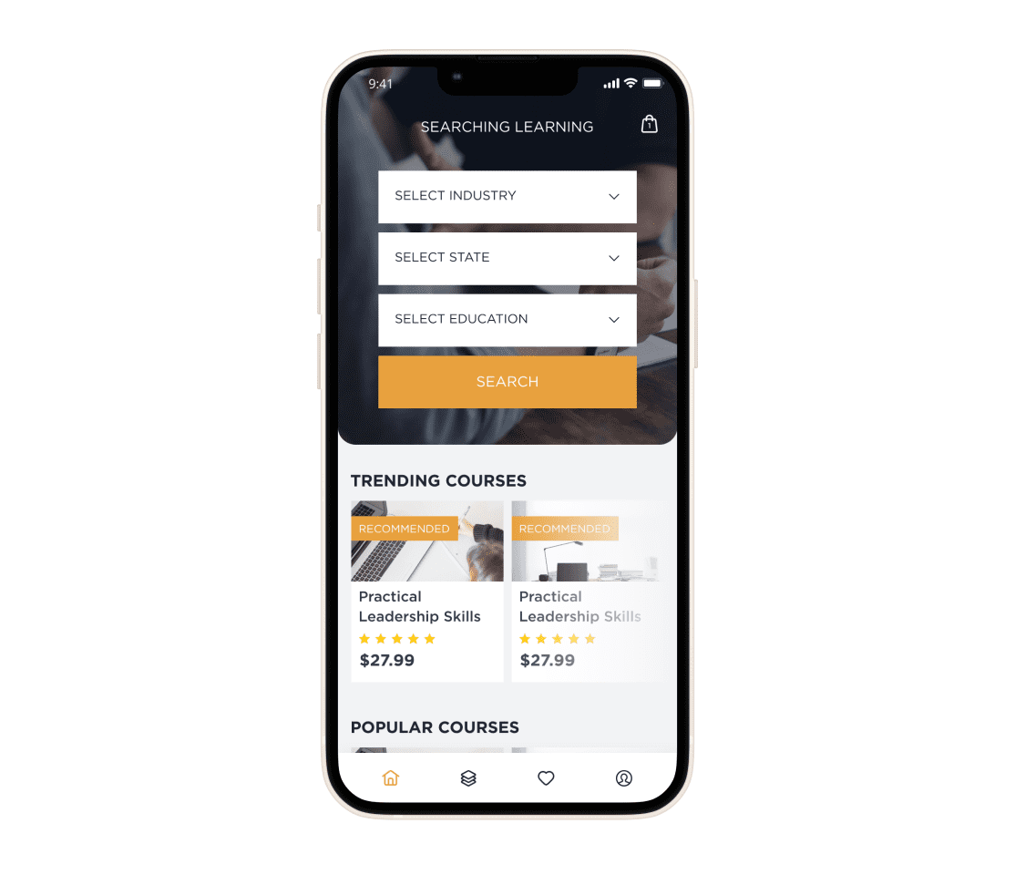
Advanced Filtering

All the available product and service options within your app can be sorted out into categories. The categories are clearly named and easy to find. So entering the required category after logging in becomes a no-brainer for your users.

After choosing a specific category, users can see detailed information about your service or product - all in an accessible and intuitive manner.

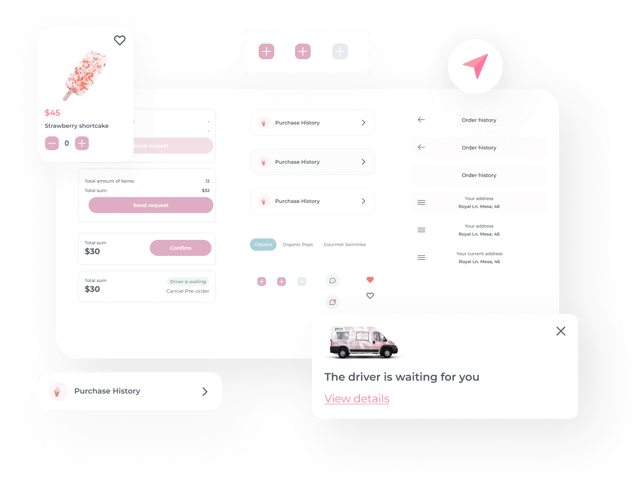
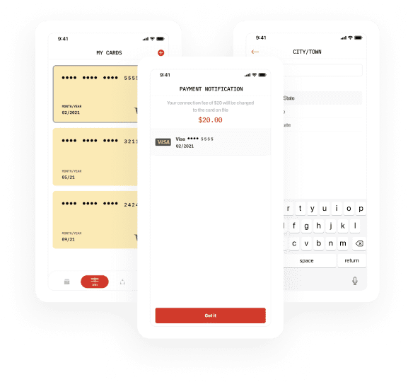
Secure In-app Payments

Your app can get an intuitive, simple-to-use in-app payment option in a few clicks, which will save your users’ time and improve the UX. Your users will get the possibility to add one or several debit/credit cards to their accounts and then select the preferable one every time.

To protect payment data from breaches, we typically use an HTTPS secure protocol, two-factor authentication, IP address verification mechanisms, and other security measures.

Ratings and Reviewing

Your application can get a rating and reviewing feature. We know that ratings and reviews are the number one feature shoppers rely on when making informed decisions when selecting a product or service.

We’ll create rating and reviewing interfaces that will be easily accessible, helpful, and engaging for your users.
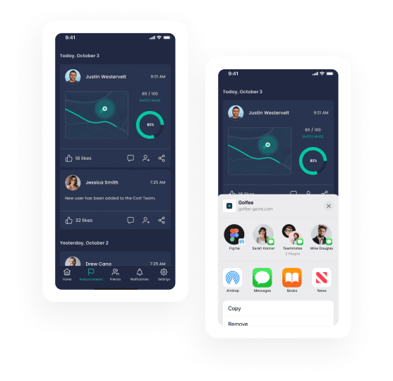
Social Sharing

With the increase in user engagement, the social sharing functionality improves your business’s chances for conversion and visibility.

We will apply the social sharing feature, giving your users the possibility to follow others, invite friends, see who is following them, get news in their spheres of interest (like adding a new course in a learning app, and much more).

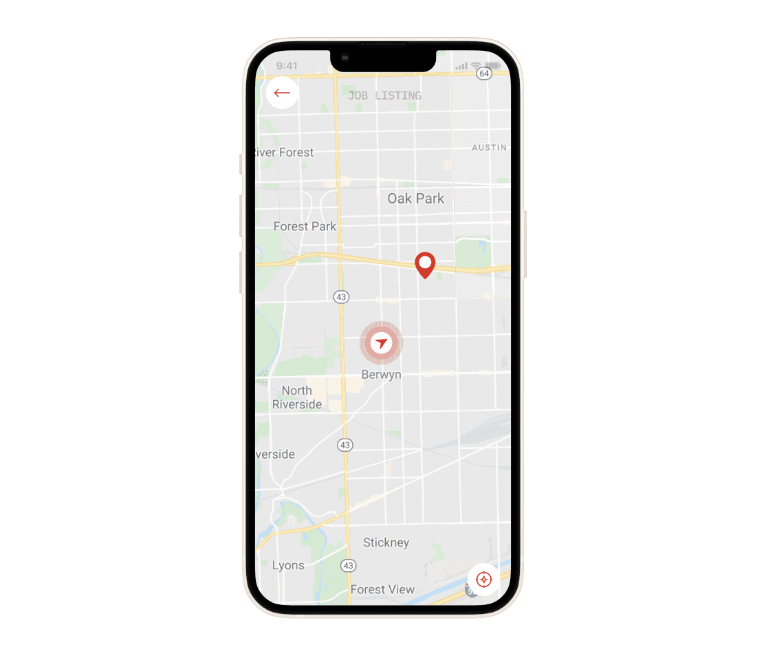
Integrated Google Maps

Integrating Google Maps will let your users select among all the available options through a visual interface. Together with bringing helpful functionality, the visual design adds aesthetic appeal and usability to your app.

Users can sort out products or services within your app on the map by distance (5Mi, 10Mi, 15Mi, 20Mi). Also, they can search through the search box. If there are no options for the search, they will get a corresponding notification.

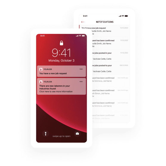
Notifications and Alerts

Your app can get such a powerful tool as notifications. They will help you introduce users to new features and updates or to inform them about new messages and events. Besides, you can track notifications, analyze the results, and experiment with your approach.

Our UX designers know how to design your notifications so that they become purposeful and non-interfering. For example, we can set up triggers to sensitize the app when to release the notification. It will help choose the best timing for notifications and deliver a positive experience to users.

Portfolio

Mobile Applications for a Sports IoT devices Manufacturer
Our client is a successful manufacturer of an innovative sports IoT device named Sportstation. We developed IOS and Android applications which can communicate with it. We also made Integration with several third-party systems, e.g. with the system of the children’s football camp of Real Madrid.
Instant Payment App Development for Mobile Banking
Belitsoft was contacted by the founders of a startup from one of the EU Member States. They wanted to create a mobile app that would support SEPA Instant Credit Transfer (SCT Inst) scheme to make real-time payments.
Android and iOS Mobile App Development for a Drone Company
Our Client, one of the world’s largest drone companies, decided to create a convenient mobile video editing app. Belitsoft has provided the Client with a team of Android and iOS mobile developers to create custom mobile apps for editing videos recorded using the drones produced by our Client.
Custom Mobile App for a Learning Management System
We developed a simple-to-use and intuitive mobile app for a Learning Management System. Available for Android and iOS. It’s a good complement to the web version.

Recommended posts

Belitsoft Blog for Entrepreneurs
Saas Website Design Inspiration: TOP-20 Header and Footer Design
1. SAAS COMPANY INVISION InVision is a web-based prototyping tool for web & app designers. It has raised a total of $134.1M in funding since launch. Header Footer 2. SAAS COMPANY SENDGRID Sendgrid is a cloud-based email app which works both for transactional email and marketing email campaigns.  It has raised a total of $80.36M in funding since launch. Header Footer 3. SAAS COMPANY LEVER Lever is a recruiting platform for human resource specialists. It has raised a total of $72.8M in funding since launch. Header Footer 4. SAAS COMPANY PERISCOPE DATA Periscope Data is a data analysis platform for data scientists. It has raised a total of $34.5M in funding since launch. Header Footer 5. SAAS COMPANY BENCH Bench is a bookkeeping app for small businesses. It has raised a total of $32.85M in funding since launch. Header Footer 6. SAAS COMPANY PIPEDRIVE Pipedrive is a CRM for sales pros. It has raised a total of $31.7M in funding since launch. Header Footer 7. SAAS COMPANY FOND Fond is a suite of employee engagement apps for companies strengthening their employer brands. It has raised a total of $25.85M in funding since launch. Header Footer 8. SAAS COMPANY LEADGENIUS LeadGenius is a lead generation app for enterprise marketing and sales leaders. It has raised a total of $20M in funding since launch. Header Footer 9. SAAS COMPANY RECURLY Recurly is a subscription billing management app for companies. It has raised a total of $19.6M in funding since launch. Header Footer 10. SAAS COMPANY INDINERO inDinero provides accounting software for small business owners. It has raised a total of $9.92M in funding since launch. Header Footer 11. SAAS COMPANY MARVEL Marvel is a is a prototyping and collaboration tool for software designers. It has raised a total of $7.98M in funding since launch. Header Footer 12. SAAS COMPANY PROVEN Proven is a hiring tool and job board app for hiring managers. It has raised a total of $4.79M in funding since launch. Header Footer 13. SAAS COMPANY ADESPRESSO AdEspresso is an app for creating, analyzing and optimizing Facebook Ads for businesses and marketers. It has raised a total of $3.2M in funding since launch and was acquired by Hootsuite. Header Footer 14. SAAS COMPANY UNBOUNCE Unbounce is a landing page builder app for marketers. It grew to over 15.6 million USD in annual recurring revenue (2016). Header Footer 15. SAAS COMPANY BUFFER Buffer is a social media scheduling app for marketers, businesses, and corporations. Today it has more than $1M/month in recurring revenue (2016). Header Footer 16. SAAS COMPANY ZAPIER Zapier is a web automation app for busy people who know their time is better spent selling, marketing, or coding.  Now, it has close to $7M in annual revenue (2016). Header Footer 17. SAAS COMPANY GROOVE Groove is a web-based help desk software for small businesses.  Today, it's recurring revenue is more than $5M / year (2016). Header Footer 18. SAAS COMPANY HUBSTAFF Hubstaff is a web-based time tracking application for remote teams. Today, it has $2,4M ARR. Header Footer 19. SAAS COMPANY CHARGIFY Chargify is a recurring billing app for SaaS companies. Today, it has $1.7M live paying subscriptions. Header Footer 20. SAAS COMPANY OLARK Olark is a live chat software for sales, marketing, and customer support on your website. Today, this app is used by 12 000 paying customers worldwide. Header Footer The professionally designed website is an excellent way to promote your brand online. Belitsoft provides full-cycle SaaS development services: from gathering requirements to web design and product development. Our SaaS web designers are always trying to stay ahead of the game. Hire us to get the web design that will sell your SaaS product.
Dzmitry Garbar • 2 min read
How to Design a Healthcare App
Mobile health is a growing IT sector that focuses on transforming how healthcare providers interact with their patients. According to Zion Market Research, the global mHealth market size is expected to reach $102.43 billion by 2022. Industry experts predict that 70% of healthcare organizations will invest in healthcare mobile app development by 2018. ‘The market for digital health tools is finally starting to catch up to the demand. Unfortunately, this increase can lead to a surge in unreliable tools. Nearly half of consumers today are considered digital health adopters—and that number is only going to rise as the benefits become apparent and tech-savvy generations get older.’ Nitin Goyal, MD, Orthopaedic Surgeon, Founder & CEO at Pulse Platform The following statistic displays the number of mHealth apps available on Google Play. During the last measured period, the store offered just over 51.000 medical apps, representing a 5.7 percent growth over the previous quarter. The most income-generating mHealth apps on Google Play are fitness and calories counter systems. Source: statista.com/statistics/779919/health-apps-available-google-play-worldwide Apps have become an essential part of the healthcare field. Medicare providers and patients all benefit from up-to-date, user-friendly, and free or minimal-cost healthcare apps. Due to rising supply, it has become increasingly important to offer a high-quality product. Thus, designing mHealth apps that provide efficient and convenient ways of providing healthcare services is among the top-most concerns of developers. In this article, we talk about what colors are best suited for healthcare mobile software and give you some examples. We then focus on app notification design. Surely we compare iOS and Android design style and show you some key differences with actual screenshots. Finally, we refer to best practices to customize your app for users with disabilities. Have an idea to create an mHealth app? Contact us to start your business! Familiarizing with colors As part of the development process, it is necessary to choose a proper color scheme and fonts. Users should feel peaceful with confidence that they run a right medicare software to address their needs and concerns. To that end, vibrant colors should be replaced with a more delicate and calm color palette. Fortunately, there are many hues to pick from both cold and warm sides of the spectrum. Cold tones are most often used for the background. These hues establish an overall sense of tranquility that is necessary to help users concentrate on the more important features of the healthcare app. White Fitbit - an activity tracker for iOS and Android Oscar Health - a health insurance app for iOS and Android Blue Calm - a meditation app A pharmacy app by Lewis+Humphreys Grey BioDigital - a 3D health visualization system Clue - a female health app Green Omada - a behavior change program HealthTap - an online doctor consultation app Warm tones are great for accent colors and for attracting attention. However, products designed in this color scheme as their dominant may be used in obstetrics and gynecology. All because in Europe and the USA, pink is often associated with the women. Pink Flo - a fertility and pregnancy calendar Blogilate - a fitness app Purple Zipdrug - a medication delivery app Cliniklik healthcare app design by Pablo Barzet, Source Yellow GoodRX - a drug price tracking app in the USA Red Pills On Time - a medication reminder and pills tracker Orange MINDBODY - fitness, salon and spa booking app App notification design Notifications are crucial to mHealth apps, especially for those that provide tracking and reminders. Giving them different designs enables indicating importance and urgency. For example, an app reminds users of their scheduled time to take a pill. Along with this, it also notifies of an upcoming physician’s appointment. To avoid confusion and highlight relevance, developers have to give the reminders various design elements. To this end, they can use color-coding, font choices, gestures, or notification behavior/animation. CareZone - a medication management app MyTherapy - a medication reminder and pill tracker Couch to 5K - a running trainer Sleep Cycle - an intelligent alarm clock For our take on healthcare software development take a look at the latest EHR we've developed. This article give insights into the approach we used: How to Build an EHR System Android vs iOS: Different design styles Most popular apps, including mHealth, are released for both iOS and Android. The following are some differences to be taken into account when developing a mobile app. — First off, the design rules for Android devices are determined by Material Design, while for iOS - by Human Interface Guidelines. The first one is based on a layered "paper" approach providing more hierarchy with realistic shadows, light, and motion. As for iOS, designers can use the effects of transparency, blurring, gradients or shadows to attract users attention. — Moving between screens is a common action users take on apps. On Android, there is a universal navigation bar at the bottom. The back button is the simplest way to go back to a previous screen and it works in all apps. Runtastic Balance Food Tracker and Calorie Counter for Android The vision on iOS is a little different. As can be seen on the screenshot below, there is no back button here. Thus, the app screen has a button on the top left corner. Moreover, designers can also use the name of the previous page behind the back icon to let customers know where they will go back. Runtastic Balance Food Tracker and Calorie Counter for iOS In addition, Apple introduced a gesture of swiping from left to right in apps to go back. The animation for the collecting samples flow for Bloodline for iOS by Bryce Thompson, Source — Apps have different areas within them, usually organized as tabs. Different sections on Android are displayed on top of the app. In addition, the Android version shows only icons on the tab row, whereas the iOS version also has labels. However, iOS app’s sections are organized as tabs on the bottom of the screen. Doctor On Demand for Android Doctor On Demand for iOS MyFitnessPal for Android MyFitnessPal for iOS — Action buttons are those that enable users to take some actions like share, upload/download etc. Both Android and iOS have their own icon styles. My Diet Coach - a weight loss motivating and tracking app for Android My Diet Coach for iOS Understand target audiences A proper quality design is important for any mobile app, but it’s especially vital when creating a program for sensitive target users. ‘I’m not the first entrepreneur to create a digital health app for patients. But as a surgeon, I’m very aware of the day-to-day issues that arise, including the nuanced relationship between patient and provider. Not all entrepreneurs in digital healthcare have this level of awareness. That means some digital health tools don’t consider a patient’s best interest.’ Nitin Goyal said The following are some obstacles disabled users have met: Blind people may use screen reader software or Braille devices to access content but only text-based. Deaf users cannot access audio content unless it is transcribed. People who can’t use a mouse have to able to access content with a keyboard alone. Users with low vision, dyslexia, or attention deficit are difficult to process extensive texts and require more white space, simple screen images, and proper color contrast. Examples of color disabilities Site: w3.org/WAI/GL/low-vision-a11y-tf/wiki/Overview_of_Low_Vision Since this field is mainly represented by older people, or who might have sensory impairments and other disabilities or technically challenged, it’s necessary to tailor healthcare mobile app design. Source: greatcall.com/greatcall/lp/is-mobile-healthcare-the-future-infographic.aspx Designing for low- and no-vision and hearing: legislation Developing software that can be used by all people without the need for adaptation or specialized design is called “universal design”. Many software companies, unfortunately, focus on the characteristics of the “average” user. ‘The term user experience is now widely used, especially by major players in the industry including Apple, IBM and Microsoft. However, in many cases, the term is contrasted to usability which is often depicted as a much narrower concept focusing on systems being easy to use.’ Tom Stewart, Chair of the ISO sub-committee With a view to making software accessible for people with disabilities, the U.S. Congress has passed legislation in a range of areas. Section 504 of the Rehabilitation Act of 1973 and its amendment 508 suggested in 1986 require that information technology funded/used by the federal government must be designed to be accessible to people with disabilities. The Americans with Disabilities Act of 1990 (ADA) and ADA Amendments Act of 2008 require public software be accessible to users with physical, sensory, or cognitive disabilities, regardless of what audience is targeted. In 2017, the U.S. Access Board published a final rule updating accessibility requirements for information and communication technology (ICT). Further, it boosts international harmonization, in particular with Canada, Germany, France, Australia, New Zealand, and Japan. Designing for low- and no-vision and hearing: best practices The “mobile accessibility” standards address devices that interact with the web, including smartphones, tablets, and wearables. Most often, mobile devices have a small screen size that limits how much information users can actually view at one time. Especially, when zoom is used by people with low vision. Some best practices for helping low-vision users to make the most of small screens include: Cut the amount of the displayed content by providing a dedicated mobile version (providing fewer content modules, fewer images, or focus on important mobile usage scenarios) or a responsive design (on narrow screens the navigation menus may be hidden until a user taps a menu button). The left picture shows a page with no modification, print preview at 100%. The picture on the right shows the same page at 200%. Source: w3.org/WAI/GL/low-vision-a11y-tf/wiki/Printing_Customized_Text Provide a reasonable default size for content and touch controls to prevent text magnification by the user. The content has to be resizable without assistive technology up to 200 percent. Supply with on-page controls to change the text size (e.g. magnifying lens view under user’s finger). Source: pcworld.com/article/3131925 Avoid using complicated and decorative fonts because they can be discerned much harder. Use standard fonts like Arial or Times New Roman instead. Create alternative CSS with a highly contrasting color scheme. The WCAG 2.0. suggests Minimum (at least 4.5:1 or 3:1 for large-scale text) and Enhanced (at least 7:1 or 4.5:1 for large-scale text) contrasts. Arrange interactive elements where they can be easily seen when the device is held in different positions. Use a range of clearly contrasting colors and hues instead of relying on black and white as the design's only contrasting colors. Type1 Diabetes Mobile App Design Source: behance.net/gallery/32173645/Type-1-Diabetes-Mobile-App Avoid hard-to-see color combos, e.g: Green & red. Green & brown. Blue & purple. Green & Blue. Blue & Grey.  Green & Grey. Indicate clearly interactive elements (buttons or links) from non-actionable elements (content, status info, etc.) through the following parameters: Conventional shape: rounded-corner shaded button shape. Iconography:  question mark, home icon, back arrow, etc. for conventional visual icons. Color offset: various text color, shape with a different background color to distinguish the element from the page background. Conventional style: underlined text and different colors for links. To ensure access to all potential audiences, it is essential that software companies develop products to be compatible with assistive technology. When a mobile app is designed to be accessible to users with a broad range of disabilities, the others benefit too. For example, video transcripts enable deaf users to access the content. However, this feature allows for viewing it in a noisy environment, or for whom English is a second language. User-friendly design An important step toward a successful UX design for mHealth apps is to practice simplicity. We’ve reviewed dozens of healthcare apps, both on Google Play and App Store, and noticed there is one thing in common: simplistic or minimalist design. Indeed, such programs give users a clean and professional experience. ‘Don’t re-invent the wheel. Use models and frameworks developed by others, and modify them as needed [...] and incorporate what has worked before. Once that framework is established, it’s easier to go in and add elements that personalize or brand the experience.’ Jeffery Kendall, SVP and GM at Kony Health tracking app by Jakub Antalík Source: dribbble.com/shots/2834322-Health-tracking-app-case-study It is also essential to facilitate the register/sign-in process. User authorization has to take the minimum amount of time avoiding numerous screens and clicks. The simplification principle also applies to emergency data accessing, like doctor phone number, prescription medication, or allergies. Icon sets used in healthcare apps should be highly intuitive so that users can easily understand what a particular icon means. However, more creative symbols can be added while including their description at hand. Thus, developers avoid the possibility of confusing their customers. Medical Icon Set by Vivek Karthikeyan Source: dribbble.com/shots/3121056-Medical-Icon-Set Medical Icons by Asif Hussain Source: dribbble.com/shots/4131178-Medical-Icons Complete Medical App by Asif Hussain Source: dribbble.com/shots/4078004-A-Complete-Medical-Application Conclusion Designing an effective healthcare mobile app requires focusing on what works best for target audiences. Design should be centered around an intuitive UI/UX and proper coloring schemes. Moreover, to reach a wide audience, mHealth apps should be tailored for sensory impairment users. You want your app to have a modern and harmonious look? Our talented designers will liven it up! Contact us for advice!
Alex Shestel • 8 min read
Design for Android vs. Design for iOS
Android vs. iOS: platform choice When deciding on a platform on which to develop your next mobile app, there are some things to keep in mind. Android has a huge market and in the second quarter of 2018, almost 88% of users worldwide had phones that run on the Android OS. IOS had a much lesser reach with slightly more than 12% consumers. The previous figures also translate into the number of app downloads. The number of Google Play apps installed per user account for the first time is about 2.8 times higher than that downloaded from Apple Store. Despite the lower number of iOS apps available, Apple generates 80% or 1.8 times more profits from its App Store. The trend is motivated by the number of factors. Among them are the availability of Apple Store in China as well as the presence of other Android app stores (like Amazon Appstore and Samsung Store).  Moreover, Apple devices are generally associated with prestige and high-end security and are owned by more affluent users. Android vs. iOS design: where to start? Design for both platforms may not seem much different at first sight. But there are specific platform features that will significantly impact the usability and perception of an app. Both Android and iOS have developed their own sets of rules, that tell how their applications should look like. Android devices are primarily based on Google’s Material Design, while Apple adheres to Human Interface Guidelines. Both operating systems support UI kits to make it easier for designers to understand how the apps should be structured and look like. For example, one can download and try out: iOS 11 iPhone GUI for Sketch by Great Simple Studio or similar GUI both for Photoshop and Sketch designed by Facebook. Android Lollipop UI Design Kit by UXPin or Android Nougat GUI by Great Simple Studio for Photoshop and Sketch. But before going deeper into platforms’ design features, let’s backtrack to this - skeuomorphism. The term “skeuomorph” is compounded from Greek skéuos (meaning 'container or tool'), and morphḗ (meaning 'shape'). According to Techopedia, “skeuomorphism refers to a design principle in which design cues are taken from the physical world.”  In other words, this is the approach of imitating the shape of real-life objects with 3D effects. The users should be able to easily deduce what the function of the element is. The aim is to invoke a feeling of familiarity in users, allowing them to apply their background knowledge. The technique was widely used in the 2000s and first years of the 2010s when most users were transiting to the digital world. It helped users get acclimated to new technologies as painlessly as possible. Source: mashable.com. IOS Newsstand looks like a wooden shelf Source: mashable.com. IOS Podcast app imitates an old fashioned recorder with spools Skeuomorphism was hugely supported by Apple and Steve Jobs was a fan of it. However, the current company's chief design officer, Jonathan Ive, does not share this standpoint. So Apple officially ditched skeuomorphism at the Worldwide Developers Conference and presented its all-new flat-based iOS 7 interface. Source: youtube.com. IOS 6 on the left, ioS 7 on the right Source: cs2024.wordpress.com. Calculator app on iOS 6 on the left, iOS 7 on the right Human Interface Guidelines is now based on three primary themes: clarity, deference, and depth. This approach celebrates minimalism, use of crisp elements, and focuses on typography and flat colors. ‘Negative space, color, fonts, graphics, and interface elements subtly highlight important content and convey interactivity.’ HIG To make the experience with the content smooth and pleasing, a designer is allowed to apply the effects of translucency and blurring. Bezels, gradients, and drop shadows can also be used, but only minimally and just to “keep the interface light and airy, while ensuring that content is paramount.” The planes do not intersect and should allow for a clear distinction between background and foreground layers. ‘Distinct visual layers and realistic motion convey hierarchy, impart vitality, and facilitate understanding.’ HIG This design perspective allows focusing on the meaningful elements while leaving things fully responsive and visually appealing. Google introduced its Material Design out of the need to unify the UI across different Android devices. The design is inspired by the real world and its textures and reimagines the mediums of paper and ink. ‘But unlike real paper, our digital material can expand and reform intelligently. Material has physical surfaces and edges. Seams and shadows provide meaning about what you can touch.’ Matías Duarte, Google's Vice President of Design In other words, Material design can be treated as an enhanced version of flat design with a touch of skeuomorphism. ‘Material design may be aesthetically flat, specifically the colors, but it is multi-dimensional: it takes the Z-axis into consideration.’ MK Cook, UX/UI Designer ‘Material design adds animation, layers, and a hint of skeuomorphism to flat design making things easily distinguishable like buttons.’ Melissa Galle, graphic design manager Android’s design aims at creating interfaces that are optimized for the digital and embrace the real world just enough to make the interface intuitive. To make things more illustrative, we will shed light on the main differences that every UX and UI designer should know before designing an app for iOS and Android. Android vs. iOS design: app icons An app icon is usually the first visual expression of your brand that a user gets acquainted with. Icons reflect the key idea and purpose of your product concisely. Every icon should be distinct and memorable, but each platform’s guidelines also have something to say about its concept and execution. All iOS icons are created square-shaped and are later automatically rounded off the corners. Apple vouches for flattened images with no transparency and a simple background. The company also recommends avoiding unnecessary elements like nonessential words, photos, and interface elements. An icon should be friendly and clear. Source: developer.apple.com Similarly, in its Material guidelines for product icons, Android, among other things, approves the use of paper shadows and provides recommendations about the range of colors to use. However, unlike iOS, Android icons can be transparent in the background and therefore get any shape that fits the icon area. Source: material.io Android vs iOS design: vocabulary differences Android and iOS share a set of basic elements, but apply different names to identify them. In order to avoid confusion, it is worth to know how each bar is called on Android and iOS. The thing is, these elements should comply with the platform style and size restrictions to provide the native user experience. Android vs iOS design: navigation Both Android and iOS have taken some different views on how the navigation of their interfaces should feel and look like. One of the core components of both Android and iOS is the status bar, where such information as time, network connection, battery charge and other system data is placed. It has a different layout on both platforms with iOS info distributed along the bar length and Android’s shifted to the right corner. The app bar/ navigation bar goes next and serves to display a name or current page of an app. On iOS, the bar is centered, while on Android it is left-sided. Source: medium.com One of the most common action users take is backward and forward moving within apps. Android provides its users with a navigation bar at the bottom. This is a set of three buttons (either physical or digital, depending on the device) that function as back, home and overview routes. IOS sticks to a little different approach. Neither its devices nor its interface has a universal back button. It means that designers must ensure decent navigation within the app and add a back indicator on the top left corner of every iOS app page.  Source: medium.com. LinkedIn Android app LinkedIn iOS app. Source: medium.com Navigation on both platforms may also differ in terms of tabs use and placement. Android originally prefers a drawer bar on the left side of the page with a hamburger menu or a top tab bar. Source: developer.android.com IOS, in its turn, firmly supports a bottom tab bar that allows for relatively easy access to the menu. Source: www.nextgeekers.com However, since 2016, bottom navigation has also become part of Android Material design and is implemented in such apps as Instagram and Foursquare. Source: play.google.com. Instagram Android app Source: itunes.apple.com. Instagram iOS app And the drawer menu is still sometimes present in iOS apps. Source: itunes.apple.com One of the most eye-catching distinctions between the two operating systems is the presence of a floating action button (FAB) on Android interfaces. It is commonly used to perform the primary action on a screen like composing an e-mail or adding a new post in a social network app. FAB usually appears in the right bottom corner to ease single-hand operation and is positioned in front of the screen content. However, sometimes it can be spotted in other places like at the junction of two areas that makes it more noticeable. As a rule, it has a circular form with an icon in the middle. Source: material.io One can also use extended buttons that are wider and contain a text label. Source: material.io The counterpart of the FAB button for iOS is a call to action button. One can typically find it in the center of tab bars or in the upper right corner, like in twitter app. Source: optocrypto.com. Twitter app for Android Source: 9to5mac.com. Twitter app for iOS However, rules are meant to be broken, and iOS apps also sometimes use those FAB. Take the LinkedIn iOS app, for example. Android vs. iOS design: typography Each system has its own default fonts that are recommended for designers to use. They help to create a sense of consistency and native look and feel across the platform. Android suggests Roboto as its default system font. IOS prefers San Francisco font, which has two variants depending on the point size. SF Pro Text is used for text 19 points or smaller, while for text 20 points or larger one should switch to SF Pro Display, and adjust the spacing between letters appropriately. Source: https://material.io Android vs. iOS: Screen resolutions When designing an app, one needs to have a solid idea of how interface elements will appear on the screens with different resolutions. One of the great tools for examining how the things might respond is Sketch’s Resizing Constraints. Android OS supports devices from different manufacturers, which leads to a number of screen sizes and densities to accommodate. Android uses a density-independent pixel (DP) as a core measurement unit. This is equivalent to iOS’ points. On a standard-resolution screen, one point counts as one pixel. High-resolution screens have a higher pixel density and require images with more pixels. When it’s time to export graphical elements, Android will, as a rule, require 1x, 1.5x, 2x, 3x and 4x scaling factor. Source: design.google Apple iOS devices are much more uniform in terms of image resolution. Source: developer.apple.com Android vs. iOS design: patterns gallery So we’ve touched upon main peculiarities of both platforms. To get some inspiration designers can also use some nice online galleries with modern apps templates. Some of them are: Dribble for Android and iOS - a resource where designers share their design samples, including the most trendy ones. Pttrns for iOS and Android — a collection of design patterns, resources, and inspiration. Inspired UI for iOS and Android - a showcase of the best examples of beautifully designed mobile apps. Mobile patterns for iOS and Android - a library of screenshots for designers and developers to reference. iOSpirations - a showcase gallery featuring the best iOS apps and icon designs for inspiration. Android Niceties — a collection of the most beautiful, well-built Android apps. Final thoughts This is by no means an ultimate list of differences between the two systems. But paying attention to these features will help you understand how the same tasks can be performed across the platforms. However, there are some examples of apps that borrow certain design patterns from their competitor’s OS principles. The final choice should depend on your users’ preferences. Belitsoft provides mobile development and design services for both iOS and Android. Our talented designers know how to create engaging interfaces that follow both systems’ best practices to make your apps stand out. Write to us to learn more!
Dmitry Kravtsov • 8 min read
Region-specific Design
Language differences Script length and font sizes Word equivalents often tend to vary in the number of symbols across different languages. Source: https://www.w3.org As seen from the table above, even cognate languages like English and German need a drastically different amount of space. For their part, the ability of logographic systems to express much more meaning with a single character always results in their conciseness. ‘English and Chinese text is typically very compact, and text translated from these languages will typically be longer in the translation than the original – sometimes to an alarming degree.’ World Wide Web Consortium (W3C) Source: medium.com (Amazon vs Pinduoduo) The images above illustrate how language conciseness can help optimize a page space, which is a pain point of most mobile apps. Each category in the English version of the Amazon app is placed horizontally, while in Chinese Pinduoduo each category name can be expressed with just two characters. The same principle is true for font sizes. Though similar at the first glance, the smallest fonts that are applicable to languages like English and Italian may render the text almost unreadable when applied to logographic languages like Chinese or other writing systems with complex calligraphy. What is more, there are a number of sophisticated scripts that typically require much greater height than Latin text: Arabic (especially Nastaliq fonts), Chinese, Devanagari (used for Hindi), Japanese, Korean, Tibetan, etc. English vs. Thai The presence of spaces between words also adds to the text stretch. Unlike most Western languages, where white spaces are used to separate words, some their Asian counterparts like Chinese, Japanese and Thai do not have any visible boundaries. Not all languages allow the use of bold and italic typefaces too. English vs. Chinese There are no universally accepted values, that would work equally well across all world languages. To avoid distorted layouts when switching between language versions, designers can either increase minimum font sizes or add programmatic changes to layouts for each language or locale. ‘In general, the more flexibly you can design your layout, the better. Allow text to reflow and avoid small fixed-width containers or tight squeezes where possible. Be especially careful about fitting text snugly into graphic designs. Separate presentation and content, so that font sizes, line heights, etc. can be easily adapted for translated text. You should also bear these ideas in mind when designing database field widths in character lengths.’ W3C Text direction Certain languages like Arabic and Hebrew arrange their task flows from right to left (RTL). To ensure the content is understood, left-to-right (LTR) layouts, including sequence of actions identifiers, should be mirrored. The elements that change their direction are: text navigation buttons direction icons text fields icons (moved to the opposite side of a field) However, the flip rule does not apply to the following items: text pieces written in an LTR language icons that don’t show direction numbers (clock, phone) charts and graphs The LTR object can be tricky though. For example, components that show the clock direction should not be mirrored. The same goes for the objects that are typically held with one’s right hand as well as for icons that show the passage of time (e.g. media playback buttons, progress indicators). Locale-specific deviations There are no small details for a successful app when it comes to cultural norms. Such things as wrong country’s currency, date formats, number or address formats can instantly make your app strange-looking. For example, Chinese users are accustomed to YYYY-MM-DD date format, while in the US it will be MM/DD/YYYY, and for Europe and Great Britain DD/MM/YYYY. Visual and color complexity Reinecke and K. Z Gajos published research that demonstrates how the country where people come from affects their preferences on how an app should look. The X-axis here reflects the degree of visual (blue) and color (red) complexity. The Y-axis, in turn, shows how much people in certain locales like such things. As seen from the chart, users in the United States like colorful designs to a certain point, after which there is a sharp drop-off. The same pattern is applied for visual complexity, although the decrease starts sooner and is more gentle. Comparing this with the color curve in Hong Kong, we see that people there like complex color combinations as much as more simple ones. KFC website in Hong Kong vs. in the USA However, the main difference between designs for Asian and Western countries lies in the fact that the former like bright and warm colorful layouts with a lot of information on one page and grid menus. These designs may often seem cluttered and illogical to Westerners used to minimalistic and laconic forms. This is partly due to the density of the characters and the absence of bold or italic typefaces in Asian languages, so they need some other ways to emphasize things. Other contributing factors are the holistic way of thinking and attention to context. Thus, users are more inclined to scan through the whole page before making an opinion. For designers, it makes sense to place the most important action items within one page and add elements that distinctly convey a certain meaning so the users can spot them quickly. Western countries, on the opposite, tend to absorb information analytically. They focus on separate data elements, processing each unit at a time. Design for Western users should be well-structured with information grouped around a certain theme. A combination of just a few colors with a lot of negative space is preferred. Culture-specific characteristics Icons and imaging The meaning of graphical elements can be drastically different depending on the region. Hence, designers should either opt for universally understood symbols as much as possible or localize controversial images for each locale. Many icons that we are familiar with, depict gestures or ideograms. However, this category should be treated with particular caution. Thumbs down gesture is widely used to express dislike or disagreement. Though used in Japan, it may cause a sort of confusion, as there its meaning is close to showing the middle finger in the US. To show “no”, Japanese people will rather choose an icon with crossed index fingers. Source: www.design-nation.com Animal symbols can also be controversial. For example, owls images are often used in Western countries in e-learning apps like Duolingo, since they symbolize wisdom. At the same time, in India owls represent foolishness and may be considered insulting. The icon depicting world is considered universal. Although different positions of the globe make it culture-specific. Source: medium.com People in Asian countries like China and Japan are characterized by a strong preference for lively images. To make icons and other images look natural and engaging, designers could add a touch of cartoon-likeness and animations when localizing for this region. Source: medium.com Designers with pictures where people are integrated into groups, especially in a family context, are more typical for collectivistic societies like China, Venezuela or Vietnam. There, the importance is given to authority, wisdom, and loyalty. In their turn, individualistic cultures like the US, Australia or the UK will emphasize personal achievements. It finds its reflection in design with more images of young people as independent entities. Color meanings Similar to images, the way people of different cultures perceive colors and their meanings varies greatly around the world. Wisely used colors can invoke associations that compel users to take particular actions. Blue is believed to be the safest color across cultures, as it has many positive associations like security, peacefulness and good health. Yet, it may also stand for sadness. In the Eastern countries, blue denotes immortality and in Hinduism, it stands for love. Connotations of red can vary from energy, love, and passion in the West to spirituality in India and death in Africa. White can symbolize purity and peace in Western countries while being a sign of death and bad luck in Korea and China. In most countries, green stands for luck, nature, and newness. Yet, in Mexico, it’s the color of independence, while in Indonesia it’s traditionally forbidden. Nationality traits We’ll cover this point with German culture peculiarities as an example. When localizing travel content for the German market, designers should address specific German characteristic - precision. ‘The systematic overview has to be given to proceed. Details are equally important to create certainty that a certain topic or project is well-thought-out. Germans prefer to compensate for their higher uncertainty by strongly relying on expertise.’ Hofstede Taking this into account, TravelBird agency came out with the localization version you can see below. Source: https://blog.prototypr.io TravelBird Netherlands v.s. TravelBird Germany The most evident changes are the list of included and excluded services and the presence of trust badges. A/B tests showed that German users tend to convert better when more information was provided. Following the same tactics, TravelBird opted for showing number of kilometers rather than hours in its car travel feature. The explanation was simple: with different driving speeds on German roads, the number of hours was meaningless. Source: https://blog.prototypr.io Number of hours v.s. Kilometers driven Key takeaways Language differences: Factors like character density and complexity may have a considerable impact on the page layout. Some cultures perceive information in right-to-left order. Yet, caution is necessary when selecting elements to mirror. Dates, phone numbers, addresses should be presented in the format that is typical for the specific locale. The same is true about currencies. Visual and color complexity: Asian cultures tend to favor bright layouts with wide color spectrum. Great attention is given to the relationships between things, in other words - context. Western cultures prefer minimalistic and laconic layouts with a combination of a few colors. The focus is on primary objects. Culture-specific characteristics: Colors are a powerful tool to encourage users to take actions. Their interpretations vary dramatically across the world. Things displayed on icons and images (e.g. gestures or animals) may have different connotations depending on the traditions and lifestyles. National traits (e.g. precision and accuracy for Germans) may require certain adjustments to the original design.
Dmitry Kravtsov • 6 min read
Elearning App Design Mistakes
Common UX/UI Design Mistakes for E-Learning Mobile Apps Badly executed information architecture Building (and maintaining) the correct information architecture of an app is vital for its future (and current) success. Content and features that are most commonly used should be placed on the top. Prioritizing features by popularity is something all designers should pay attention to. How do you define which functions would be used more commonly? Well, it starts with using your intuition and researching the best practices of other apps. Then make adjustments according to feedback. The core of the problem: not putting enough effort on planning information architecture within the app. While this seems to be an important issue, lack of consistent analysis in planning is an often met thing. The designers should focus on a mobile platform and what is important to users. The navigation in the E-Learning app should remain as simple as it gets. Some designers might complain that every app is using a minimalistic approach now, but in most cases, this is just what is demanded. Learning online is hard enough already, no need to make things more complex. In short, smooth information architecture is no rocket science. However, being overlooked, it might cause plenty of troubles in usability. Consistency issues The core of the problem: using too many font types, different styles on the same page of an app. It is not just the same font types on a single screen, using different fonts across several screens also confuses users. It is not just about fonts, color scheme should remain consistent throughout all the pages on an E-Learning app. More on that in the next section. Aside from simple pieces of advice like “don’t use more than three fonts per page”, there is nothing to suggest an overall improvement of this component. Overall consistency eliminates users’ confusion and helps them save some time on navigation learning. Wrong colors The core of the problem: selecting “wrong” color combinations Choosing the correct scheme should not be an issue for the experienced designer and yet those cases are still met. Some people choose Viber messenger instead of WhatsApp just because they like purple more than green. This doesn’t make lots of sense, but, as Kahneman stated in his book “Think Fast, Think Slow” - human beings are not as rational as one might think. Focus on a nice contrast between the text and background colors. Using some software to select the needed colors might help UX designers get close to the perfect color combination. Cluttering elements Even if the course is fantastic and well-structured no one is going to dive in should it be presented in a cluttered way. The core of the problem: not making right alignments and overcrowding the information Certainly, badly-structured E-Learning course is an awful thing. Dealing with an unclear and cluttered UI is also quite bad and users won’t take it. Keep all the important information in user’s sight - that is the general guideline here. Lack of interaction feedback What brings good applications closer to perfection? Good timely adjustments based on the feedback from the users. The core of the problem: not gathering feedback on UX/UI The perfect example of working with the feedback is demonstrated by one of the leaders at E-Learning market - Duolingo. They have plenty of forums and react to users’ requests immediately, making their design responsive in all the senses possible. Source: duolingo.com For instance, users absolutely love the adorable owl. As an element of gamification, one is able to select a dress for him after completing a certain learning task. This is not really applicable to UX/UI functions, yet a very illustrative example of reacting on feedback. Feedback comes in many forms - community messages, visual clues to name a few. The main qualifying criteria for its competence that it has to be natural and come from the users who use this E-Learning app on the regular basis. Visual Design Mistakes that are Hurtful for E-Learning Courses User doesn’t know what to focus on The well-structured course is the one user completes in a manner its creators intended. Eye moving patterns aren’t something new and certainly aren’t something that could be ignored by the designers. People tend to scan the screen in a Z pattern. However, their patterns might be influenced by changing colors, font sizes, restructuring other elements of the course. This part is often overlooked. Oftentimes E-Learning courses focus solely on the info that comes the user’s way and don’t even try to display information in a representative way. What could be done about it? As our designer Kate claimed, at the beginning of her career she got acquainted with “The Non-Designer’s Design Book”. A must-have for designers. It contained the idea of CRAP - contrast, repetition, alignment, and proximity principles. Should they all be intact, the user will follow the way the designer had prepared for them. All the things displayed on-screen should be there for a reason: it is called an intentional design. Poor images execution Bad images executions is an often-met design mistake that is easily solved. Sometimes inserted images get “managed” to make them fit, or being moved to another page or side. If it is done carelessly the images get scrunched, but not scaled. Course designers should keep a close look at the ratio of the images and keep it intact. The overall inconsistent visual style We’ve briefly touched this mistake in the previous article section. It makes sense to repeat some statements one more time. It would absolutely kill the mood of the user of each screen or slide will be made in a different manner. The slide-to-slide manner of completing the job might lead to this. This is just a single example of visual inconsistency in E-Learning courses that could be presented in LMS (Learning Management System) for instance. Other elements of visual inconsistency are: Using too many fonts and switching recklessly between them Overcrowding the free space on the page without leaving any white spaces Using decorative images instead of practical ones (just for sake of filling the gaps) Not applying any design mapping Alignment Looks Sloppy If you are not new to online courses, you perhaps have seen the ones with poor and sloppy alignment. These courses are lacking visual balance if you will. Online courses, like furniture in your apartments, also need feng shui in terms of alignment and keeping it throughout the whole length of it. One doesn’t need to be a feng shui master to figure out that a lonely chair in the center of the room is not the right furniture placement and bugs out the general impression of the coziness of such room. It just doesn’t look right. It might make an understanding of the course content more complex. To fix this issue, designers should have consistent margins and align objects in the same manner through the whole course. Any switch in justification (from left-justified to center) should be reasonable or avoided if it is not really needed. Grid systems are helpful to keep the objects aligned. The designers in Belitsoft usually use Bootstrap for these purposes. Consistencies, Functional and External You might be tired of hearing the word “consistency” across the article as we focus on it a lot. Goes without saying that having all elements of e-learning app work in a similar way is beneficial for the users. Leaving visual elements aside (we’ve got it covered in the previous two section with plenty of details), there is also functional and external consistency. Functional consistency means that every interactive element should work in a similar way within the e-learning app. After all, the design is not just for making the app look “cool”. What matters the most is users’ convenience. Feedback from the target audience might help with design as well. A/B testing comes handy for defining small elements of e-learning app design, If you are uncertain about which of the two options would make a better impact on the learning abilities of users - A/B test it till you get it close to perfection. As for external consistency, Design must be consistent across multiple products. It is especially important for e-learning products. One should be able to have access to the learning materials on mobile, laptop or tablet without getting to know each platform’s design individually. As online education should be available from all types of devices, and it’s vital for e-learning software to be cross-platform. As a practical step on the way to keeping this kind of consistency: Respect platform guidelines Apple’s Human Interface Guidelines and Google’s Material Design Guidelines could serve to give a general direction. Users get used to their interaction patterns of each OS (iOS and Android), and anything that contradicts general guidelines could push them away.
Dmitry Baraishuk • 6 min read
eLearning Developers and Instructional Designers
How Belitsoft Can Help We can leverage our 10+ years of experience in eLearning development to assist you with the following: Learning course development. Using our knowledge of modern authoring tools, we can make a series of interesting and effective lessons for your learners. Custom eLearning development. Unique course development is our specialty. If you have an idea that no authoring tool can bring to life, that’s something we’ll be glad to help you with. Instructional design. Choosing the appropriate methodology, setting reasonable objectives, and ensuring that the course will do what you want it to do. Gamification. Designing a system of incentives that will keep your learners immersed and engaged. Serious games development. If you have an idea of a game-based learning program, we can assist you with all the technical matters from game design to coding and post-launch support. We can do it for PCs, web, and mobile platforms. GET A FREE QUOTE Definitions An instructional designer is a person who systematically designs, develops, and delivers instructional products and experiences, both digital and physical, in a consistent and reliable fashion toward an efficient, effective, appealing, engaging, and inspiring acquisition of knowledge. They are the person busy defining the objectives of a course, interviewing subject matter experts, planning out gamification incentives, etc. In a digital course, an instructional designer will prepare storyboards, work with designers to set up the appropriate visual style, and explain to the developers how each function should work. Put simply, an instructional designer lays the foundation of a course like an architect plans a building, although they might work on content. An eLearning developer, on the other hand, is responsible for implementing the design. They will study the storyboard to locate problematic areas, for example, features that can’t be implemented with the selected tools or functionality that would overextend the budget. Then they will use one of the authoring tools and potentially some custom programming to create the learning course. One thing they both do is working with learner feedback. An instructional designer deals with changes to the lessons and the curriculum in general, while the developer handles the technical side of the things. Instructional Designer’s Skills Set This is what an instructional designer should know and be able to do: Working with subject matter experts. One can’t be a master in everything. To create a good learning course, an instructional designer will interview people who have intimate knowledge of the subject and transform that knowledge into educational content. Content creation. An instructional designer writes scripts for educational videos, creates texts, and plans out presentations. An eLearning developer will then turn them into a finished course. Scientific approach. An instructional designer makes crucial decisions in crafting a course. These decisions should be based on solid research and reliable data to ensure the course’s effectiveness. Selecting the right learning methodology. For example, kids react better to game-based approaches than adults. Team management. An instructional designer can lead a dedicated development team that works on the course: eLearning developer, graphic designer, actor, etc. They are responsible for the entire project. One thing both specialists work on is learner feedback. Instructional designers address the issues with the curriculum and the general direction of each lesson, while eLearning developers handle all the technical matters. Instructional Design Models and Theories These are some of the common approaches that instructional designers use in their work. ADDIE The acronym stands for the five phases of this process: Analysis, Design, Development, Implementation, and Evaluation. This is one of the most widespread approaches and often is the foundation for others of its kind. Analysis. This is the phase where the instructional designer defines the problem to be solved, estimates the learners’ skill level, and sets the goals for the course. Design. This stage is for planning the content and its format and partitioning it into lessons. It also includes choosing the evaluation methods, designing the interface, and (possibly) prototyping. Development. Once the course is planned out, it is time to actually develop it. This can be the shortest or the longest part of the process, depending on the nature of the content. Implementation. At this stage, the course is put into practice. However, it also includes training the instructors - explaining all the bits and pieces of the course to them. As a result, they should know both the subject matter and the specific teaching methods used. Evaluation. This is a strange phase: some of it goes on continuously throughout the whole development process, but there is also a dedicated evaluation stage at the end to ensure that the course achieves its goals set up at the analysis phase. ADDIE seems reasonable, but it actually has significant flaws. ARCS This is another acronym, that stands for Attention, Relevance, Confidence, and Satisfaction - the four things that this model focuses on. It was developed by John Keller, a prominent scholar in the field of instructional design. Attention. The first step is attracting the learners’ attention and making sure it remains focused. This can be done in many ways: active participation (e.g. games, practical exercises, roleplay, etc.), content variability, humor, and more. Relevance. The second step is demonstrating that your content will be useful to the learners. This can be done by showing examples of how this will help them today or in the future, being successful in the field you are teaching or inviting successful guest speakers. Confidence. The learners need to understand that the success is definitely possible. Their confidence can be reinforced by setting incremental goals, providing encouraging feedback, giving the learners some measure of control over their studies, etс. Satisfaction. There is scientific evidence showing that enjoyment is a major success factor in teaching. This means it is important to make the learning process fun to improve the outcomes. This can be done by giving people an option to use their skills in a real-world setting, rewarding success in challenging tasks, or even adding elements of entertainment. Dick and Carey This model was developed by Walter Dick, Lou Carey, and James Carey. It builds on ADDIE by adding the behavioral elements. Source Dick and Carey model consists of 10 steps: Identify instructional goals. These goals are the expectation for the learners at the end of the course. They can be broad and describe what your students should be able to do. Conduct instructional analysis. The first step is to find out what do your learners need to know and be able to do to achieve the desired results. After that, you can plan the steps that lead the learners to the goal. Identify entry behaviors. Gather the relevant data, including your learners’ demographics, skill level, motivation level, domain knowledge, etc. Then use it to set up the learning process in a way that doesn’t have them revisiting what they already know but also lets their existing knowledge support the new information. Set up performance objectives. Such objectives need to include the description of the skill to be learned, the metrics to evaluate these skills, and the conditions under which these skills are used. Develop assessment tools. This is the stage where you should develop tests and quizzes that evaluate both the learners’ progress and the instructional process. Develop an instructional strategy. This means planning out the activities that will help the learners achieve the instructional goals from item 1. Develop and choose learning materials. Reuse the fitting learning content to save time or create new modules. Design and conduct a formative evaluation. This means checking whether your course is good enough while it’s still in development. Conduct a summative evaluation. Once your course is live, monitor the learning outcomes, and see if the course achieves its goals. Revise instruction. Use the data from the evaluation to improve the course, if necessary. Merrill’s Principles of Instruction (MPI) This approach was postulated by M. David Merrill, Professor Emeritus of Utah State University in his paper. The principles mentioned are the fundamentals of effective teaching. Learning is promoted when learners are engaged in solving real-world problems. Adding meaningful context (like showing how geometry is useful for architecture) improves the learning outcomes. Learning is promoted when the previous relevant experience is activated. If learners already have knowledge and skill that would help them, start with engaging it. If they don’t, give them this foundation. Learning is promoted when the instruction demonstrates what is to be learned. Show the learners what they will be able to do over the course of the course and by its end to reinforce motivation. Learning is promoted when the learners are required to use their new knowledge or skills to solve problems. Include practical exercises after the theoretical lectures to increase knowledge retention and demonstrate the application of the knowledge. Learning is promoted when learners are encouraged to integrate their new knowledge or skill into everyday life. This is pretty self-explanatory - if a person keeps using their new skill daily, it will only improve their efficiency. Which Instructional Design Model Is the Best To Go With? All and none. As usual, the answer depends entirely on you, your goals, and your conditions. However, we can give some pointers. Account for your experiences. If you already had encounters with certain models, you probably know their advantages and disadvantages. Some of them might be just what you need or might become what you need with a little tweaking. Keep in mind, that you should also note the prejudices that might keep you from selecting approaches that would suit you. Start with your goals.The objective comes before the means to achieve it. Thankfully, pretty much any model includes setting goals as a starting point. Go to it and choose the approach that will give you the results you want in the best way. Evaluate all the elements of a model. You might find yourself attracted to a certain element from ADDIE and ignore the negative ramifications of the rest. That’s why you should evaluate the approach holistically. Also, there is nothing stopping you from combining several of them, if it suits you. Consult your eLearning team. Your combined knowledge and experience would be more than the sum of its parts. Besides, they would be the people implementing the model you’ve chosen, so it would be wise to consider their opinion. Consider your audience. Your learners will be the recipient of everything developed with your model, so pick the one that suits their preferences. Plan in advance. The world is changing rapidly. Make sure you will pick a model that would lead to lasting content, applicable in the long term. Instructional Design Strategies for eLearning There are potentially hundreds of viable strategies and their combinations that you can use to enhance your learning process. We will describe a couple of the ones that have proven their effectiveness so you will have a good starting point. 1. Narrative Having a story behind your course helps improve the learners’ engagement and turns a boring “listen-and-click” program into an adventure. All the creative methods that work for a book or a movie would work for a narrative-based course as well. This strategy is often used in sales training, leadership training, compliance training, and other niches. For example, there is a GamiCad - and interactive training program for using AutoCAD that has the learners build and launch a spaceship over the course of their learning. 2. Scenario-based Similar to a narrative approach, this strategy has learners use their knowledge and skill in a simulation of a situation they might actually find themselves in. This allows them to adjust their behavior and increases their motivation by showing them real-life examples where they would be able to excel. The most important aspects of this strategy are: Practical situations Relatable characters Appropriate challenge level Individual feedback. As an example of such an approach, take a look at the “Road Warrior” - a sales training game at SAP. 3. Microlearning Microlearning is a method of breaking up content into bite-sized chunks. This is very useful for just-in-time learning, giving the student the knowledge they need here and now. It also works well as a supplement to the formal course. Microlearning can be presented in many formats, including AR/VR, videos, infographics, etc. The main things to do in microlearning are: Remove all the unnecessary content Present information in a conversational tone Focus on 5-10 minute lessons that answer a specific question or solve a specific problem. YourPrimer, a business skills training app, would be a good example of what is microlearning and how it can be used effectively. 4. Gamification Gamification is using game elements in a serious environment. It is a popular trend that has research backing up its effectiveness. Note that it is different from game-based learning, where a game is used as a primary instruction method. It is widely used in both corporate training and elsewhere. Examples include Deloitte Leadership Academy, Duolingo, Bridgestone Compliance Battle Royale, and more. To learn more about this approach read our article on it. eLearning Developer’s Skills Set And these skills are in the purview of an eLearning developer: Knowing the technical standards for eLearning software products There are certain standards that define how eLearning content can be packaged and how its use can be tracked. They are supported by most modern learning management systems and are great for the reusability of content: if you decide to switch to a different system, you just reupload what you need in a couple of clicks instead of remaking it to fit different requirements. The most popular standards are: SCORM, xAPI (also known as Tin Can API, Experience API), LTI, AICC, cmi5 Knowing how to work with SCORM is especially important, as it is still the most widespread of its kind. However, xAPI and cmi5 are the most advanced, offer the best tracking capabilities, and are compatible with SCORM-packaged content.  Utilizing authoring tools where possible to cut costs Authoring tools are specialized software for making eLearning content. These tools dramatically decrease the development time compared to custom programming. Authoring tools have special features that make producing digital educational materials faster and with better results.  When checking out a candidate’s CV, look for the following: iSpring, Articulate, Captivate, Elucidat, Gomo, etc. eLearning Programming Some custom courses can’t be developed with authoring tools. They require programming knowledge (or hiring a custom eLearning development company). Any eLearning developer worth his salt needs to have basic web development skills, as they are needed rather often in this line of work. So the CV should have at least these three skills on it: HTML, CSS, and JavaScript. Simply put, these technologies are used for making visuals for web-based learning content. Even the best lessons would be ineffective if they are garishly colored, use mismatched fonts, and are difficult to navigate, so an eLearning developer needs to make sure the design is implemented perfectly.  Other skills in this area might include PHP, Java, XML, SQL, C#, .NET, and others. Look for the ones that are relevant to the task at hand.  Visual content editing Sometimes a company doesn’t have the budget to get an authoring tool license but has already bought the picture and video editing software.  All the assets may be provided by the instructional designer or a dedicated graphic designer. For all the other cases, eLearning developers also should know how to work with vector graphics, video editing suites, and Photoshop, Illustrator or Figma. Knowing the principles of making good elearning UX Knowledge of how to design a convenient and intuitive user flow is a major benefit for the eLearning developer. It allows them to make content that is accessible and easy to understand, which, in turn, makes the content more effective.  There is no uniform way to describe one’s UX skills on a CV. So see if the candidate mentions anything that has to do with user experience design or just ask about this during an interview.  Participation in the project We’ll describe the stages of an eLearning product development and show where an instructional designer and an eLearning developer come in. 1. Preparation Stage Before the actual work begins, there are matters of setting objectives, budgeting, and planning. This is when an instructional designer talks to the stakeholders, determines the needs, and starts outlining the course. An eLearning developer doesn’t have anything to do at this point, so their work is not required. 2. Design Stage The instructional designer, based on the goals and budgets, will put together a design document and a storyboard. Together with the eLearning developer, they will review it and make it more realistic. This is also the stage where the eLearning developer is given the required assets or makes them on his own. The instructional designer’s work on the learning content begins in earnest. 3. Development Stage This is the time where an eLearning developer shines. With authoring tools (and sometimes custom programming) the course is brought to life. An instructional designer could still prepare the content and provide it as it becomes ready. But most of the work is done by the eLearning developer. 4. Testing Stage Both positions are involved in the process. Instructional designer watches mostly for the learning side of things: how well does the content perform, are the objectives reached, and how motivated the users are. eLearning developer is busy with the technical matters: do all the features work as intended and what needs to be fixed (if anything). 5. Post-Launch Support Stage After the course goes live, the eLearning developer and the instructional designer can continue working on making it better. The latter could come up with new ways to improve KPIs (completion rate, knowledge retention, etc.) and the former will make them happen. eLearning Development Portfolio Experienced eLearning developers accumulate a portfolio, showcasing their work. This is one way it could look, based on our own eLearning development work. TET - a driving theory course TET is an online course that helps people prepare for their driving theory exam in the Netherlands. It’s now a popular learning solution with over 22.000 happy users and an average rating of 8.5/10. This is what the customer envisioned: Mock Exams. Tests similar to the actual one are at the core of the course. They both help prepare for the questions and give explanations of why a certain answer is correct so that the user can learn better. Gamification. A progress bar and various stats to motivate users and help them complete the course by adjusting their expectations. Separate sections for different vehicles. The course targets those who want to pass the exams for car, motorcycle, or scooter.  The course had to be custom-built as its structure doesn’t fit any existing learning platform. The work required a redesign of the system’s dashboard and making it look like a dashboard of the relevant vehicle.  The gamification system had to be built from scratch according to the customer’s design.  The content for mock exams (e.g. animations) had to be developed from the ground up.  Extraas - a game-based learning platform The customer wanted to launch an eLearning website that would help school students prepare for important exams. It would be a cheaper and more convenient alternative to private tutors. This is what the client wanted for the course: Game-based learning. Serious games are at the core of the experience. According to research, the target audience reacts better to them. Two main elements: math and language. The platform was to be launched in the Netherlands, and the leading elements would be the most demanded there. Currently, no popular eLearning platform supports game-based learning. So this one had to be custom-built. The platform required us to create many learning games. To make this process more efficient, we developed our own engine that could be used as a foundation. This allowed us to save the customer’s time and budget.  Extraas turned out to be a resounding success with thousands of users and an average review rating of 9.4/10. Ticken - a touch-typing course The customer had an idea for a course that would be more efficient than any of its competitors. The existing ones were either too boring, too slow, or too outdated in their methodology. Here’s how the client decided to approach his course: Practice first. Instead of the “video-quiz” pattern, it focuses on the exercises which have students start typing words early. It gives a feeling of usefulness and increases engagement. Gamification. The course uses leaderboards points. They are intended to motivate users and foster a feeling of competition. In addition, there are several typing games that help learners relax while still using the skills they picked up. Brevity. The course contains only the most vital information and exercises to save students’ time. It is also rational from the business perspective, as it decreases development costs. The core of the course required exercises that weren’t supported by any major eLearning platform. So an eLearning developer was required to make a custom one.  The gamification system and learning games were developed according to the customer’s guidelines. We used our technical know-how to implement them. As a result, Ticken has become a huge success, gaining over 100.000 users and winning several awards.
Dmitry Baraishuk • 13 min read

Our Clients' Feedback

zensai
technicolor
crismon
berkeley
hathway
howcast
fraunhofer
apollomatrix
key2know
regenmed
moblers
showcast
ticken
Next slide
Let's Talk Business
Do you have a software development project to implement? We have people to work on it. We will be glad to answer all your questions as well as estimate any project of yours. Use the form below to describe the project and we will get in touch with you within 1 business day.
Contact form
We will process your personal data as described in the privacy notice
This site is protected by reCAPTCHA and the Google Privacy Policy and Terms of Service apply
Call us

USA +1 (917) 410-57-57

UK +44 (20) 3318-18-53

Email us

[email protected]

to top