It’s surprising how the same UI/UX design pattern may affect users of a different culture in a way we never expect. Even in an age of internationalization, people attach great importance to their customs and cultural heritage and want businesses to respect them too. The article covers dimensions that are shaped by one’s cultural background and shows how we can adapt app & web designs for a natural look and feel in a particular region.
Language differences
Script length and font sizes
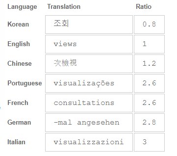
Word equivalents often tend to vary in the number of symbols across different languages.
 Source: https://www.w3.org
As seen from the table above, even cognate languages like English and German need a drastically different amount of space. For their part, the ability of logographic systems to express much more meaning with a single character always results in their conciseness.
‘English and Chinese text is typically very compact, and text translated from these languages will typically be longer in the translation than the original – sometimes to an alarming degree.’
World Wide Web Consortium (W3C)
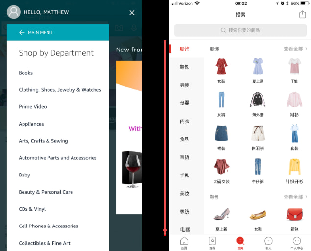 Source: medium.com (Amazon vs Pinduoduo)
The images above illustrate how language conciseness can help optimize a page space, which is a pain point of most mobile apps. Each category in the English version of the Amazon app is placed horizontally, while in Chinese Pinduoduo each category name can be expressed with just two characters.
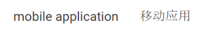
The same principle is true for font sizes. Though similar at the first glance, the smallest fonts that are applicable to languages like English and Italian may render the text almost unreadable when applied to logographic languages like Chinese or other writing systems with complex calligraphy. What is more, there are a number of sophisticated scripts that typically require much greater height than Latin text: Arabic (especially Nastaliq fonts), Chinese, Devanagari (used for Hindi), Japanese, Korean, Tibetan, etc.
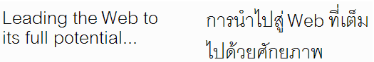 English vs. Thai
The presence of spaces between words also adds to the text stretch. Unlike most Western languages, where white spaces are used to separate words, some their Asian counterparts like Chinese, Japanese and Thai do not have any visible boundaries. Not all languages allow the use of bold and italic typefaces too.
 English vs. Chinese
There are no universally accepted values, that would work equally well across all world languages. To avoid distorted layouts when switching between language versions, designers can either increase minimum font sizes or add programmatic changes to layouts for each language or locale.
‘In general, the more flexibly you can design your layout, the better. Allow text to reflow and avoid small fixed-width containers or tight squeezes where possible. Be especially careful about fitting text snugly into graphic designs. Separate presentation and content, so that font sizes, line heights, etc. can be easily adapted for translated text. You should also bear these ideas in mind when designing database field widths in character lengths.’
W3C
Text direction
Certain languages like Arabic and Hebrew arrange their task flows from right to left (RTL).
To ensure the content is understood, left-to-right (LTR) layouts, including sequence of actions identifiers, should be mirrored.
The elements that change their direction are:
- text
- navigation buttons
- direction icons
- text fields icons (moved to the opposite side of a field)
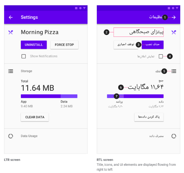
However, the flip rule does not apply to the following items:
- text pieces written in an LTR language
- icons that don’t show direction
- numbers (clock, phone)
- charts and graphs
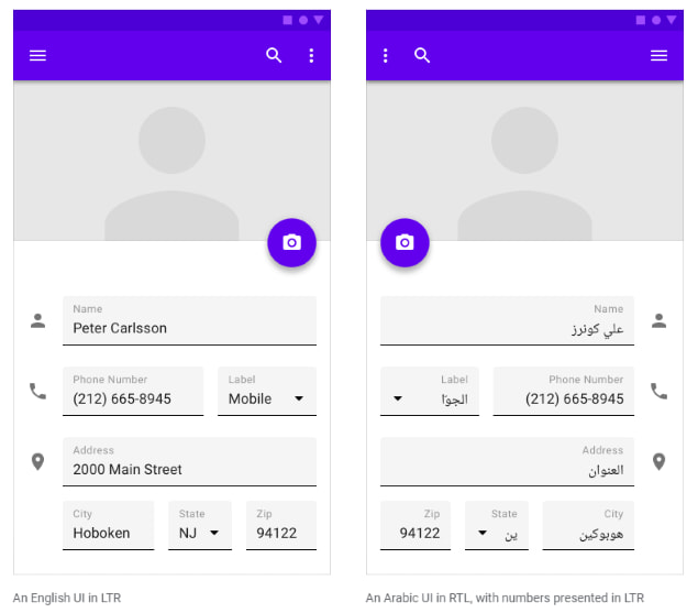
The LTR object can be tricky though. For example, components that show the clock direction should not be mirrored. The same goes for the objects that are typically held with one’s right hand as well as for icons that show the passage of time (e.g. media playback buttons, progress indicators).
Locale-specific deviations
There are no small details for a successful app when it comes to cultural norms. Such things as wrong country’s currency, date formats, number or address formats can instantly make your app strange-looking.
For example, Chinese users are accustomed to YYYY-MM-DD date format, while in the US it will be MM/DD/YYYY, and for Europe and Great Britain DD/MM/YYYY.
Visual and color complexity
Reinecke and K. Z Gajos published research that demonstrates how the country where people come from affects their preferences on how an app should look.
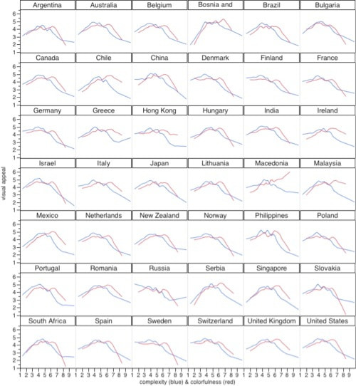
The X-axis here reflects the degree of visual (blue) and color (red) complexity. The Y-axis, in turn, shows how much people in certain locales like such things.
As seen from the chart, users in the United States like colorful designs to a certain point, after which there is a sharp drop-off. The same pattern is applied for visual complexity, although the decrease starts sooner and is more gentle.
Comparing this with the color curve in Hong Kong, we see that people there like complex color combinations as much as more simple ones.
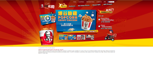
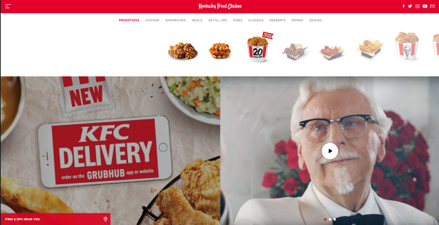 KFC website in Hong Kong vs. in the USA
However, the main difference between designs for Asian and Western countries lies in the fact that the former like bright and warm colorful layouts with a lot of information on one page and grid menus. These designs may often seem cluttered and illogical to Westerners used to minimalistic and laconic forms.
This is partly due to the density of the characters and the absence of bold or italic typefaces in Asian languages, so they need some other ways to emphasize things. Other contributing factors are the holistic way of thinking and attention to context. Thus, users are more inclined to scan through the whole page before making an opinion.
For designers, it makes sense to place the most important action items within one page and add elements that distinctly convey a certain meaning so the users can spot them quickly.
Western countries, on the opposite, tend to absorb information analytically. They focus on separate data elements, processing each unit at a time. Design for Western users should be well-structured with information grouped around a certain theme. A combination of just a few colors with a lot of negative space is preferred.
Culture-specific characteristics
Icons and imaging
The meaning of graphical elements can be drastically different depending on the region. Hence, designers should either opt for universally understood symbols as much as possible or localize controversial images for each locale.
Many icons that we are familiar with, depict gestures or ideograms. However, this category should be treated with particular caution.
Thumbs down gesture is widely used to express dislike or disagreement. Though used in Japan, it may cause a sort of confusion, as there its meaning is close to showing the middle finger in the US. To show “no”, Japanese people will rather choose an icon with crossed index fingers.
Animal symbols can also be controversial. For example, owls images are often used in Western countries in e-learning apps like Duolingo, since they symbolize wisdom. At the same time, in India owls represent foolishness and may be considered insulting. The icon depicting world is considered universal. Although different positions of the globe make it culture-specific.
People in Asian countries like China and Japan are characterized by a strong preference for lively images. To make icons and other images look natural and engaging, designers could add a touch of cartoon-likeness and animations when localizing for this region.
Designers with pictures where people are integrated into groups, especially in a family context, are more typical for collectivistic societies like China, Venezuela or Vietnam. There, the importance is given to authority, wisdom, and loyalty.
In their turn, individualistic cultures like the US, Australia or the UK will emphasize personal achievements. It finds its reflection in design with more images of young people as independent entities.
Color meanings
Similar to images, the way people of different cultures perceive colors and their meanings varies greatly around the world. Wisely used colors can invoke associations that compel users to take particular actions.
Blue is believed to be the safest color across cultures, as it has many positive associations like security, peacefulness and good health. Yet, it may also stand for sadness. In the Eastern countries, blue denotes immortality and in Hinduism, it stands for love.
Connotations of red can vary from energy, love, and passion in the West to spirituality in India and death in Africa. White can symbolize purity and peace in Western countries while being a sign of death and bad luck in Korea and China. In most countries, green stands for luck, nature, and newness. Yet, in Mexico, it’s the color of independence, while in Indonesia it’s traditionally forbidden.
Nationality traits
We’ll cover this point with German culture peculiarities as an example.
When localizing travel content for the German market, designers should address specific German characteristic - precision.
‘The systematic overview has to be given to proceed. Details are equally important to create certainty that a certain topic or project is well-thought-out. Germans prefer to compensate for their higher uncertainty by strongly relying on expertise.’
Hofstede
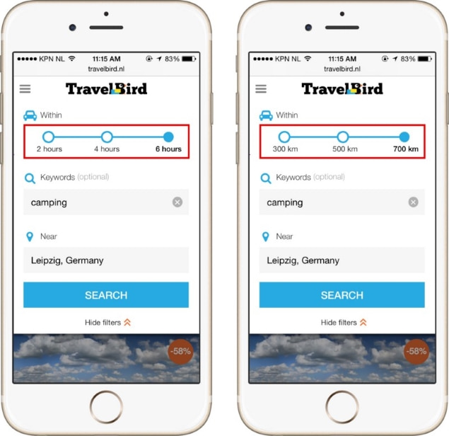
Taking this into account, TravelBird agency came out with the localization version you can see below.
 Source: https://blog.prototypr.io
TravelBird Netherlands v.s. TravelBird Germany
The most evident changes are the list of included and excluded services and the presence of trust badges. A/B tests showed that German users tend to convert better when more information was provided.
Following the same tactics, TravelBird opted for showing number of kilometers rather than hours in its car travel feature. The explanation was simple: with different driving speeds on German roads, the number of hours was meaningless.
 Source: https://blog.prototypr.io
Number of hours v.s. Kilometers driven
Key takeaways
Language differences:
- Factors like character density and complexity may have a considerable impact on the page layout.
- Some cultures perceive information in right-to-left order. Yet, caution is necessary when selecting elements to mirror.
- Dates, phone numbers, addresses should be presented in the format that is typical for the specific locale. The same is true about currencies.
Visual and color complexity:
- Asian cultures tend to favor bright layouts with wide color spectrum. Great attention is given to the relationships between things, in other words - context.
- Western cultures prefer minimalistic and laconic layouts with a combination of a few colors. The focus is on primary objects.
Culture-specific characteristics:
- Colors are a powerful tool to encourage users to take actions. Their interpretations vary dramatically across the world.
- Things displayed on icons and images (e.g. gestures or animals) may have different connotations depending on the traditions and lifestyles.
- National traits (e.g. precision and accuracy for Germans) may require certain adjustments to the original design.

Recommended posts
.png)
.jpg)
.jpg)
.png)
.png)
.jpg)
.png)
.jpg)
.png)
.jpg)
.jpg)
.jpg)
.jpg)
.png)
.png)
.jpg)
.jpg)
.jpg)
.jpg)
.jpg)
.jpg)
.jpg)
.png)
.png)
.png)
.jpg)
Our Clients' Feedback


Belitsoft has been the driving force behind several of our software development projects within the last few years. This company demonstrates high professionalism in their work approach. They have continuously proved to be ready to go the extra mile. We are very happy with Belitsoft, and in a position to strongly recommend them for software development and support as a most reliable and fully transparent partner focused on long term business relationships.

Global Head of Commercial Development L&D at Technicolor
They use their knowledge and skills to program the product, and then completed a series of quality assurance tests. We were working in an agile way with them. Belitsoft performed very well throughout our project. We are definitely looking at Belitsoft as a long-term partner.

Service Delivery Director at Crimson (United Kingdom)
I highly recommend Belitsoft for website design and development. We were up against a tight deadline to launch the project. The work was delivered on time and within budget! I will continue working with Belitsoft as a valued partner for our web development!

Program Administrator at UC Berkeley (United States)
We have worked with Belitsoft team over the past few years on projects involving much customized programming work. They are knowledgeable and are able to complete tasks on schedule, meeting our technical requirements. We would recommend them to anyone who is in need of custom programming work.

Main Partner at Hathway Tech (United States)
Belitsoft company is able to make changes instantly. One of our internal engineers has commented about how clean their code is. Belitsoft seems to know what they're doing, which I appreciate.

Co-Founder at HOWCAST MEDIA (United States)
It was a great pleasure working with Belitsoft software development company. New requirements and adjustments were implemented fast and precisely. We can recommend Belitsoft and are looking forward to start a follow-up project.

Head of Division at Fraunhofer FIT (Germany)
Belitsoft company has been able to provide senior developers with the skills to support back end, native mobile and web applications. We continue today to augment our existing staff with great developers from Belitsoft.

CEO at Apollo Matrix (United States)
Belitsoft company delivered dedicated development team for our products, and technical specialists for our clients' custom development needs. We highly recommend to use this company if you want the same benefits.

Managing Director at Key2Know A/S in 2012 (Denmark)
We approached BelITsoft with a concept, and they were able to convert it into a multi-platform software solution. Their team members are skilled, agile and attached to their work, all of which paid dividends as our software grew in complexity.

COO at Regenerative Medicine LLC (United States)
Having worked with Belitsoft as a service provider, I must say that I'm very pleased with the company's policy. Belitsoft guarantees first-class service through efficient management, great expertise, and a systematic approach to business. I would strongly recommend Belitsoft's services to anyone wanting to get the right IT products in the right place at the right time.

CEO at Moblers
If you are looking for a true partnership Belitsoft company might be the best choice for you. They have proven to be most reliable, polite and professional. The team managed to adapt to changing requirements and to provide me with best solutions. I strongly recommend Belisoft.

Director at ShowCast Limited (Germany)
I expected and demanded a lot of you at Belitsoft company, but you exceeded my expectations. You acted pro-actively, challenged me at the right moments. Thanks!"

CEO at Ticken B.V. (Netherlands)
We have been working for over 10 years and they have become our long-term technology partner. Any software development, programming, or design needs we have had, Belitsoft company has always been able to handle this for us.
Founder from ZensAI (Microsoft)/ formerly Elearningforce