Steve Jobs, Apple’s CEO, once said: "Most people make the mistake of thinking design is what it looks like. People think it's this veneer - that the designers are handed this box and told, 'Make it look good!' That's not what we think design is. It's not just what it looks like and feels like. Design is how it works." Design is all about user experience and both Android and iOS are continuously working on developing their styles. As a result, each platform has its approach and a set of specific rules that should be taken into account when designing an app. Read on to learn more!
Android vs. iOS: platform choice
When deciding on a platform on which to develop your next mobile app, there are some things to keep in mind.
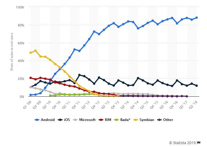
Android has a huge market and in the second quarter of 2018, almost 88% of users worldwide had phones that run on the Android OS. IOS had a much lesser reach with slightly more than 12% consumers.
The previous figures also translate into the number of app downloads.
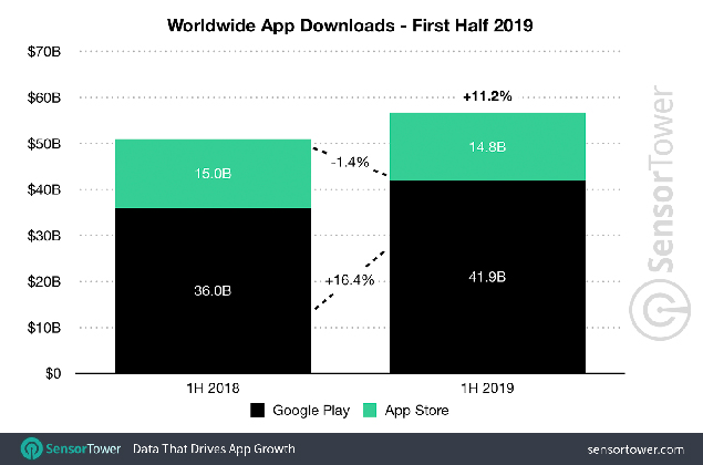
The number of Google Play apps installed per user account for the first time is about 2.8 times higher than that downloaded from Apple Store.
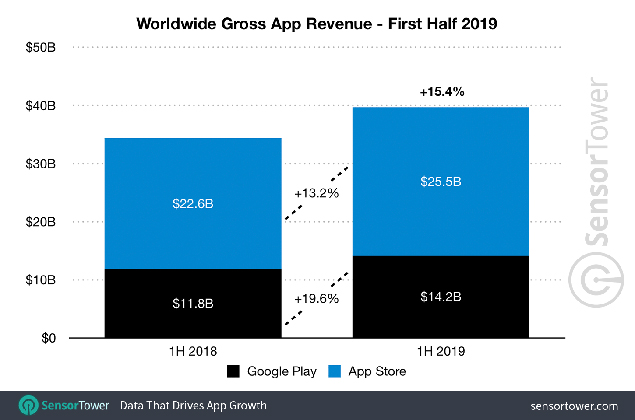
Despite the lower number of iOS apps available, Apple generates 80% or 1.8 times more profits from its App Store.
The trend is motivated by the number of factors. Among them are the availability of Apple Store in China as well as the presence of other Android app stores (like Amazon Appstore and Samsung Store). Moreover, Apple devices are generally associated with prestige and high-end security and are owned by more affluent users.
Android vs. iOS design: where to start?
Design for both platforms may not seem much different at first sight. But there are specific platform features that will significantly impact the usability and perception of an app.
Both Android and iOS have developed their own sets of rules, that tell how their applications should look like. Android devices are primarily based on Google’s Material Design, while Apple adheres to Human Interface Guidelines.
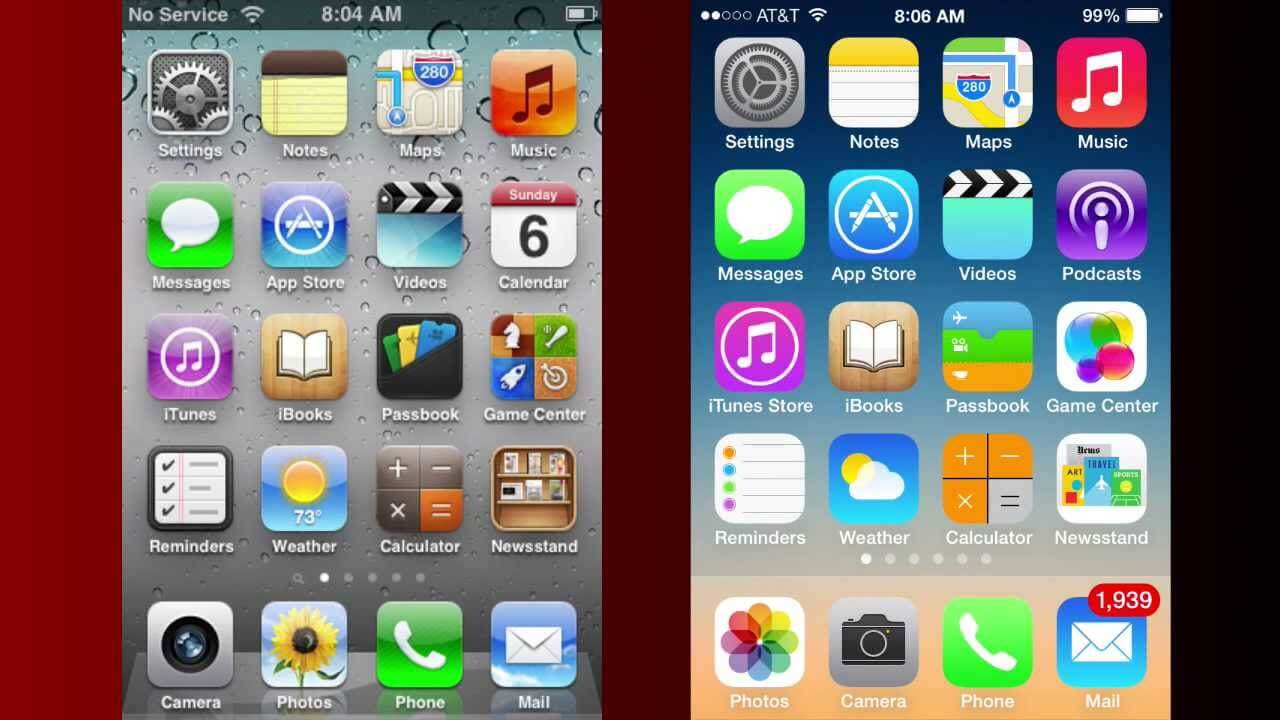
Both operating systems support UI kits to make it easier for designers to understand how the apps should be structured and look like. For example, one can download and try out:
- iOS 11 iPhone GUI for Sketch by Great Simple Studio or similar GUI both for Photoshop and Sketch designed by Facebook.
- Android Lollipop UI Design Kit by UXPin or Android Nougat GUI by Great Simple Studio for Photoshop and Sketch.
But before going deeper into platforms’ design features, let’s backtrack to this - skeuomorphism.
The term “skeuomorph” is compounded from Greek skéuos (meaning 'container or tool'), and morphḗ (meaning 'shape'). According to Techopedia, “skeuomorphism refers to a design principle in which design cues are taken from the physical world.” In other words, this is the approach of imitating the shape of real-life objects with 3D effects. The users should be able to easily deduce what the function of the element is. The aim is to invoke a feeling of familiarity in users, allowing them to apply their background knowledge.
The technique was widely used in the 2000s and first years of the 2010s when most users were transiting to the digital world. It helped users get acclimated to new technologies as painlessly as possible.
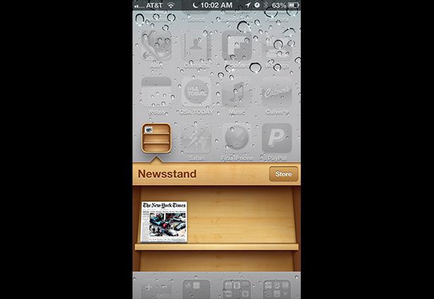 Source: mashable.com. IOS Newsstand looks like a wooden shelf
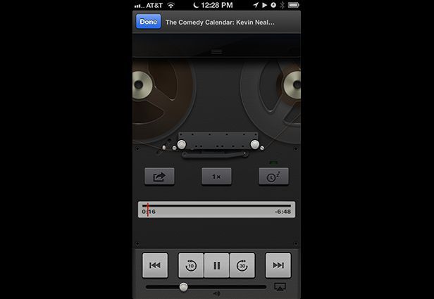 Source: mashable.com. IOS Podcast app imitates an old fashioned recorder with spools
Skeuomorphism was hugely supported by Apple and Steve Jobs was a fan of it. However, the current company's chief design officer, Jonathan Ive, does not share this standpoint. So Apple officially ditched skeuomorphism at the Worldwide Developers Conference and presented its all-new flat-based iOS 7 interface.
 Source: youtube.com. IOS 6 on the left, ioS 7 on the right
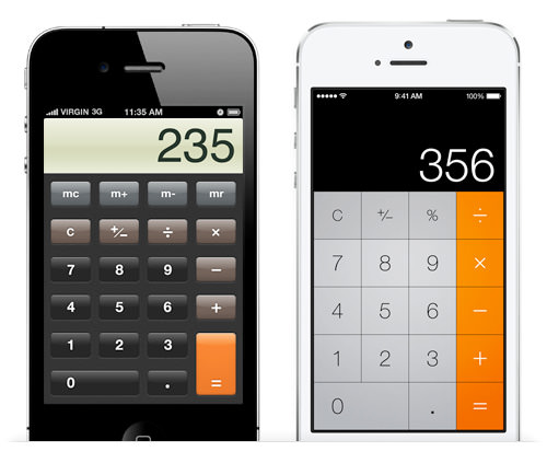 Source: cs2024.wordpress.com. Calculator app on iOS 6 on the left, iOS 7 on the right
Human Interface Guidelines is now based on three primary themes: clarity, deference, and depth.
This approach celebrates minimalism, use of crisp elements, and focuses on typography and flat colors.
‘Negative space, color, fonts, graphics, and interface elements subtly highlight important content and convey interactivity.’
HIG
To make the experience with the content smooth and pleasing, a designer is allowed to apply the effects of translucency and blurring. Bezels, gradients, and drop shadows can also be used, but only minimally and just to “keep the interface light and airy, while ensuring that content is paramount.”
The planes do not intersect and should allow for a clear distinction between background and foreground layers.
‘Distinct visual layers and realistic motion convey hierarchy, impart vitality, and facilitate understanding.’
HIG
This design perspective allows focusing on the meaningful elements while leaving things fully responsive and visually appealing.
Google introduced its Material Design out of the need to unify the UI across different Android devices. The design is inspired by the real world and its textures and reimagines the mediums of paper and ink.
‘But unlike real paper, our digital material can expand and reform intelligently. Material has physical surfaces and edges. Seams and shadows provide meaning about what you can touch.’
Matías Duarte, Google's Vice President of Design
In other words, Material design can be treated as an enhanced version of flat design with a touch of skeuomorphism.
‘Material design may be aesthetically flat, specifically the colors, but it is multi-dimensional: it takes the Z-axis into consideration.’
MK Cook, UX/UI Designer
‘Material design adds animation, layers, and a hint of skeuomorphism to flat design making things easily distinguishable like buttons.’
Melissa Galle, graphic design manager
Android’s design aims at creating interfaces that are optimized for the digital and embrace the real world just enough to make the interface intuitive.
To make things more illustrative, we will shed light on the main differences that every UX and UI designer should know before designing an app for iOS and Android.
Android vs. iOS design: app icons
An app icon is usually the first visual expression of your brand that a user gets acquainted with. Icons reflect the key idea and purpose of your product concisely. Every icon should be distinct and memorable, but each platform’s guidelines also have something to say about its concept and execution.
All iOS icons are created square-shaped and are later automatically rounded off the corners. Apple vouches for flattened images with no transparency and a simple background. The company also recommends avoiding unnecessary elements like nonessential words, photos, and interface elements. An icon should be friendly and clear.
 Source: developer.apple.com
Similarly, in its Material guidelines for product icons, Android, among other things, approves the use of paper shadows and provides recommendations about the range of colors to use. However, unlike iOS, Android icons can be transparent in the background and therefore get any shape that fits the icon area.
 Source: material.io
Android vs iOS design: vocabulary differences
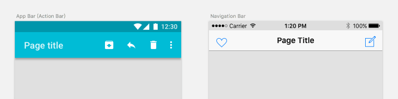
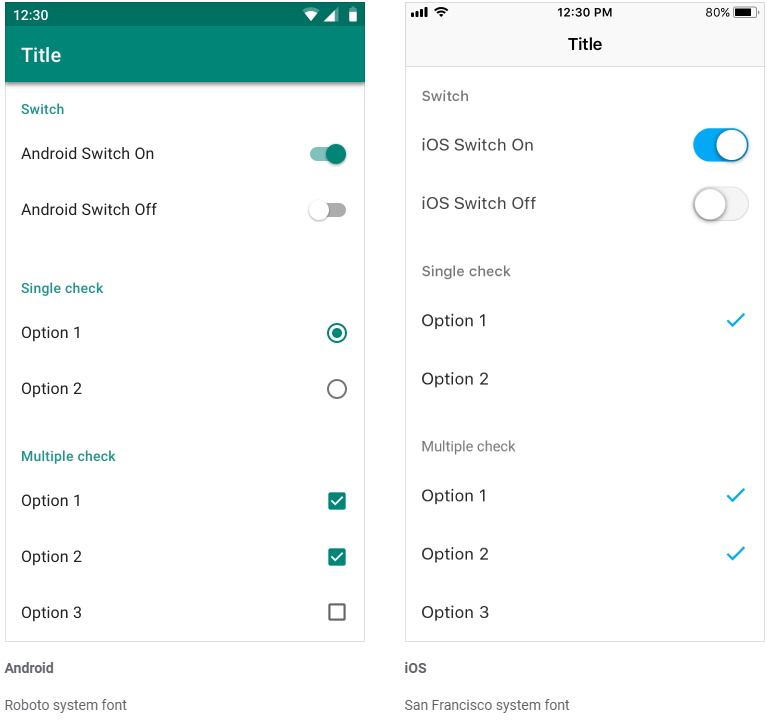
Android and iOS share a set of basic elements, but apply different names to identify them. In order to avoid confusion, it is worth to know how each bar is called on Android and iOS. The thing is, these elements should comply with the platform style and size restrictions to provide the native user experience.
Android vs iOS design: navigation
Both Android and iOS have taken some different views on how the navigation of their interfaces should feel and look like.
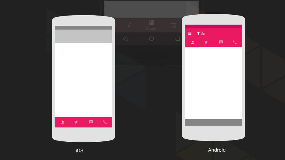
One of the core components of both Android and iOS is the status bar, where such information as time, network connection, battery charge and other system data is placed. It has a different layout on both platforms with iOS info distributed along the bar length and Android’s shifted to the right corner.
The app bar/ navigation bar goes next and serves to display a name or current page of an app. On iOS, the bar is centered, while on Android it is left-sided.
 Source: medium.com
One of the most common action users take is backward and forward moving within apps. Android provides its users with a navigation bar at the bottom. This is a set of three buttons (either physical or digital, depending on the device) that function as back, home and overview routes.
IOS sticks to a little different approach. Neither its devices nor its interface has a universal back button. It means that designers must ensure decent navigation within the app and add a back indicator on the top left corner of every iOS app page.
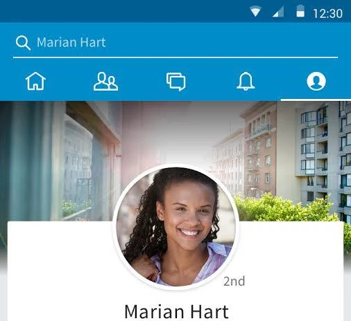 Source: medium.com. LinkedIn Android app
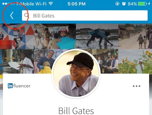 LinkedIn iOS app. Source: medium.com
Navigation on both platforms may also differ in terms of tabs use and placement. Android originally prefers a drawer bar on the left side of the page with a hamburger menu or a top tab bar.
 Source: developer.android.com
IOS, in its turn, firmly supports a bottom tab bar that allows for relatively easy access to the menu.
 Source: www.nextgeekers.com
However, since 2016, bottom navigation has also become part of Android Material design and is implemented in such apps as Instagram and Foursquare.
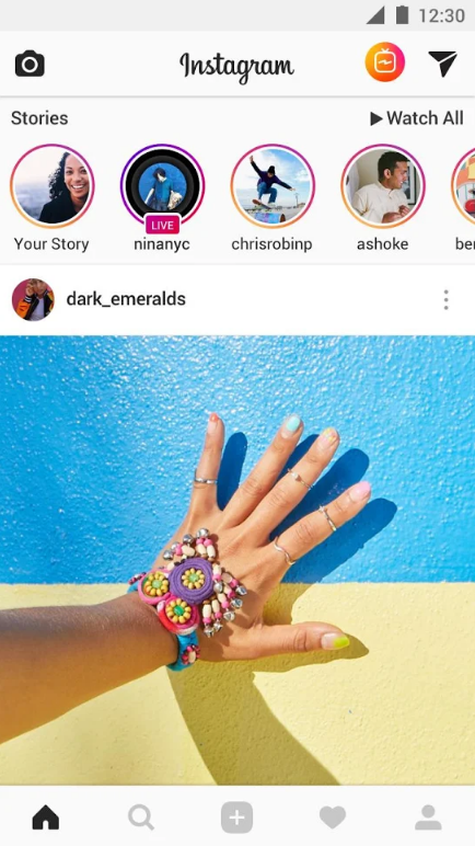 Source: play.google.com. Instagram Android app
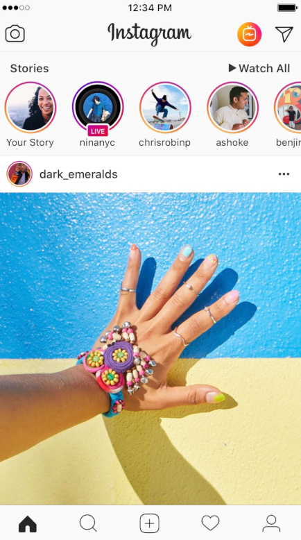 Source: itunes.apple.com. Instagram iOS app
And the drawer menu is still sometimes present in iOS apps.
 Source: itunes.apple.com
One of the most eye-catching distinctions between the two operating systems is the presence of a floating action button (FAB) on Android interfaces. It is commonly used to perform the primary action on a screen like composing an e-mail or adding a new post in a social network app. FAB usually appears in the right bottom corner to ease single-hand operation and is positioned in front of the screen content. However, sometimes it can be spotted in other places like at the junction of two areas that makes it more noticeable. As a rule, it has a circular form with an icon in the middle.
 Source: material.io
One can also use extended buttons that are wider and contain a text label.
 Source: material.io
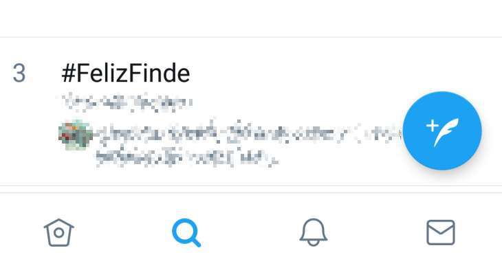
The counterpart of the FAB button for iOS is a call to action button. One can typically find it in the center of tab bars or in the upper right corner, like in twitter app.
 Source: optocrypto.com. Twitter app for Android
 Source: 9to5mac.com. Twitter app for iOS
However, rules are meant to be broken, and iOS apps also sometimes use those FAB. Take the LinkedIn iOS app, for example.
Android vs. iOS design: typography
Each system has its own default fonts that are recommended for designers to use. They help to create a sense of consistency and native look and feel across the platform.
Android suggests Roboto as its default system font. IOS prefers San Francisco font, which has two variants depending on the point size. SF Pro Text is used for text 19 points or smaller, while for text 20 points or larger one should switch to SF Pro Display, and adjust the spacing between letters appropriately.
 Source: https://material.io
Android vs. iOS: Screen resolutions
When designing an app, one needs to have a solid idea of how interface elements will appear on the screens with different resolutions. One of the great tools for examining how the things might respond is Sketch’s Resizing Constraints.
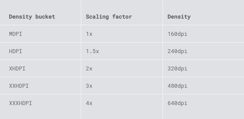
Android OS supports devices from different manufacturers, which leads to a number of screen sizes and densities to accommodate.
Android uses a density-independent pixel (DP) as a core measurement unit. This is equivalent to iOS’ points. On a standard-resolution screen, one point counts as one pixel. High-resolution screens have a higher pixel density and require images with more pixels.
When it’s time to export graphical elements, Android will, as a rule, require 1x, 1.5x, 2x, 3x and 4x scaling factor.
 Source: design.google
Apple iOS devices are much more uniform in terms of image resolution.
 Source: developer.apple.com
Android vs. iOS design: patterns gallery
So we’ve touched upon main peculiarities of both platforms.
To get some inspiration designers can also use some nice online galleries with modern apps templates. Some of them are:
Dribble for Android and iOS - a resource where designers share their design samples, including the most trendy ones.
Pttrns for iOS and Android — a collection of design patterns, resources, and inspiration.
Inspired UI for iOS and Android - a showcase of the best examples of beautifully designed mobile apps.
Mobile patterns for iOS and Android - a library of screenshots for designers and developers to reference.
iOSpirations - a showcase gallery featuring the best iOS apps and icon designs for inspiration.
Android Niceties — a collection of the most beautiful, well-built Android apps.
Final thoughts
This is by no means an ultimate list of differences between the two systems. But paying attention to these features will help you understand how the same tasks can be performed across the platforms. However, there are some examples of apps that borrow certain design patterns from their competitor’s OS principles. The final choice should depend on your users’ preferences.
Belitsoft provides mobile development and design services for both iOS and Android. Our talented designers know how to create engaging interfaces that follow both systems’ best practices to make your apps stand out. Write to us to learn more!

Recommended posts
.jpg)
.jpg)
.jpg)
.jpg)
.jpg)
![How to Create a Language Learning App [The Ultimate Guide!]](/uploads/images/blog/posts/previews/image_155352483594-image(600x250-crop).png)
.jpg)
.jpg)
.png)
.jpg)
.png)
.jpg)
.jpg)
.jpg)
.jpg)
.jpg)
.jpg)
.jpg)
.png)
.jpg)
.jpg)
.jpg)
.png)
Our Clients' Feedback


Belitsoft has been the driving force behind several of our software development projects within the last few years. This company demonstrates high professionalism in their work approach. They have continuously proved to be ready to go the extra mile. We are very happy with Belitsoft, and in a position to strongly recommend them for software development and support as a most reliable and fully transparent partner focused on long term business relationships.

Global Head of Commercial Development L&D at Technicolor
They use their knowledge and skills to program the product, and then completed a series of quality assurance tests. We were working in an agile way with them. Belitsoft performed very well throughout our project. We are definitely looking at Belitsoft as a long-term partner.

Service Delivery Director at Crimson (United Kingdom)
I highly recommend Belitsoft for website design and development. We were up against a tight deadline to launch the project. The work was delivered on time and within budget! I will continue working with Belitsoft as a valued partner for our web development!

Program Administrator at UC Berkeley (United States)
We have worked with Belitsoft team over the past few years on projects involving much customized programming work. They are knowledgeable and are able to complete tasks on schedule, meeting our technical requirements. We would recommend them to anyone who is in need of custom programming work.

Main Partner at Hathway Tech (United States)
Belitsoft company is able to make changes instantly. One of our internal engineers has commented about how clean their code is. Belitsoft seems to know what they're doing, which I appreciate.

Co-Founder at HOWCAST MEDIA (United States)
It was a great pleasure working with Belitsoft software development company. New requirements and adjustments were implemented fast and precisely. We can recommend Belitsoft and are looking forward to start a follow-up project.

Head of Division at Fraunhofer FIT (Germany)
Belitsoft company has been able to provide senior developers with the skills to support back end, native mobile and web applications. We continue today to augment our existing staff with great developers from Belitsoft.

CEO at Apollo Matrix (United States)
Belitsoft company delivered dedicated development team for our products, and technical specialists for our clients' custom development needs. We highly recommend to use this company if you want the same benefits.

Managing Director at Key2Know A/S in 2012 (Denmark)
We approached BelITsoft with a concept, and they were able to convert it into a multi-platform software solution. Their team members are skilled, agile and attached to their work, all of which paid dividends as our software grew in complexity.

COO at Regenerative Medicine LLC (United States)
Having worked with Belitsoft as a service provider, I must say that I'm very pleased with the company's policy. Belitsoft guarantees first-class service through efficient management, great expertise, and a systematic approach to business. I would strongly recommend Belitsoft's services to anyone wanting to get the right IT products in the right place at the right time.

CEO at Moblers
If you are looking for a true partnership Belitsoft company might be the best choice for you. They have proven to be most reliable, polite and professional. The team managed to adapt to changing requirements and to provide me with best solutions. I strongly recommend Belisoft.

Director at ShowCast Limited (Germany)
I expected and demanded a lot of you at Belitsoft company, but you exceeded my expectations. You acted pro-actively, challenged me at the right moments. Thanks!"

CEO at Ticken B.V. (Netherlands)
We have been working for over 10 years and they have become our long-term technology partner. Any software development, programming, or design needs we have had, Belitsoft company has always been able to handle this for us.
Founder from ZensAI (Microsoft)/ formerly Elearningforce